20+ Squarespace Button Styles: A Toolkit for Design Mastery
A well-placed button on your Squarespace website can be a great way to get someone's attention!
You can use buttons to encourage people to buy your products, sign up for your newsletter, or give you their contact details.
The more striking your buttons are, the better. I've put together over 20 quick tweaks you can use to make your Squarespace buttons stand out!
Not sure how to add a button? This guide to Squarespace buttons will show you how to get started!
1. Add a gradient to your button
A stunning gradient button is great for drawing people in and encouraging them to click on your call to action.
Spark Plugin provides you with a simple, code-free way to create a gradient button in the colorway of your choosing.
2. Add a rotating video button
Got videos on your Squarespace website? Rather than the standard 'play button', this funky code-free customization creates an animated circle icon that encourages your customers to watch!
Don’t want a rotating button? There are three other cool Squarespace animated buttons to choose from instead!
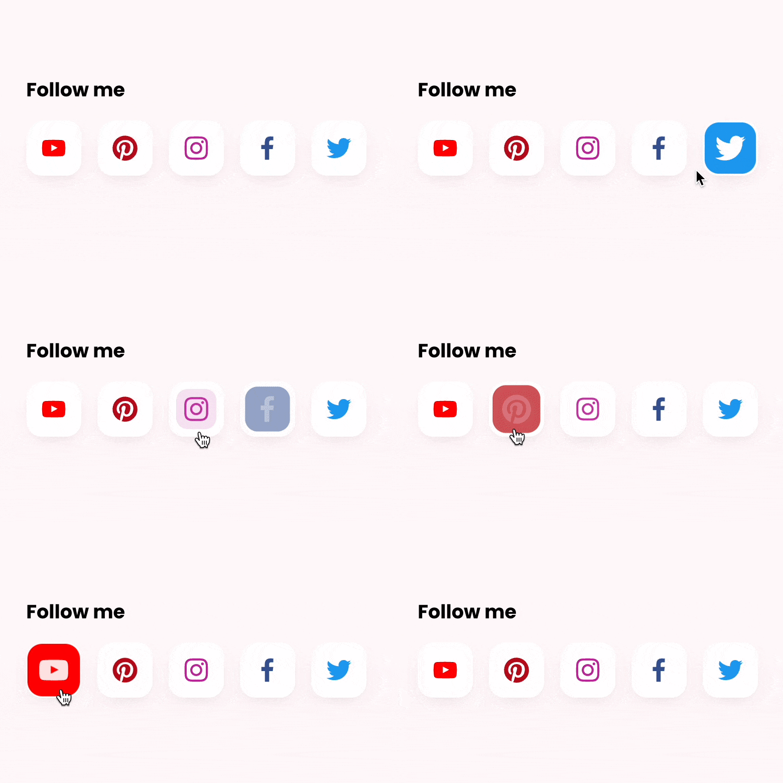
3. Animate your social icon buttons
If your main aim is to get people to follow and like you on social, an animated social icon will help increase conversions.
These buttons change color when a web user hovers over them and are available in five different sizes!
4. Add a reveal
Your button doesn’t have to be immediately visible on your page. Why not use this Spark Plugin customization to add an air of mystery to your content?
When a visitor hovers over an image or piece of text, it will magically show your button! This customization also works well for other elements on your website too, for example, if you want to replace a photo with another photo.
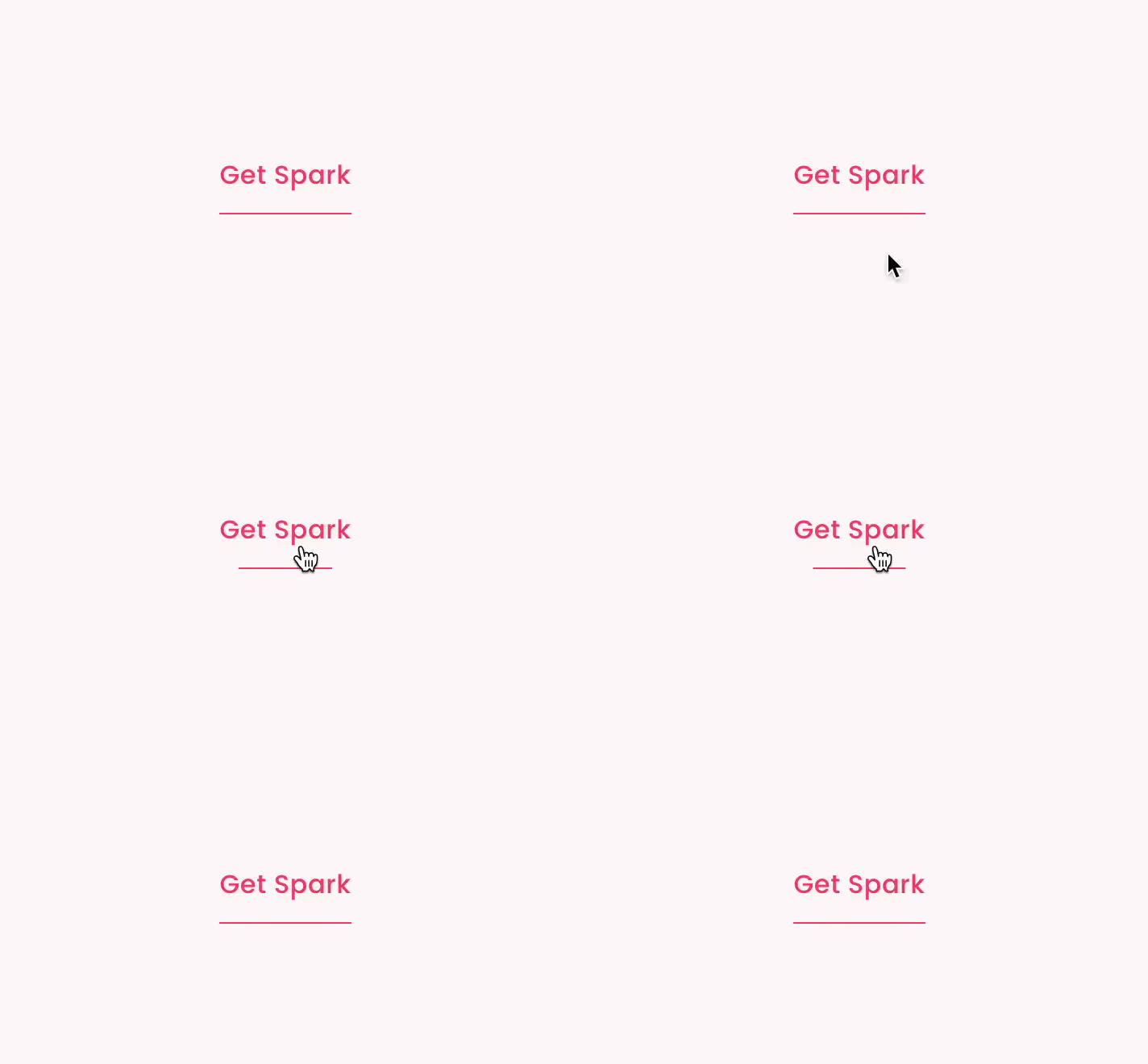
5. Add a minimalist button
This customization transforms your button into an animated underlined link. This Squarespace animated button is fantastic if you have a simple site design, or don’t want to use lots of brightly-colored, distracting buttons.
I’ve seen lots of Squarespace websites use this code-free customization to fantastic effect!
6. Transform your button into a video
If you want to add a video to your page but you don’t want to clutter it up with distractions, this video lightbox customization is perfect.
Just click the button, and your video will appear in a pop-up lightbox, meaning you can have a streamlined page that still provides visitors with lots of value!
7. Change your button font size
It can be tricky increasing or decreasing your button font size in Squarespace, but this Spark Plugin customization makes the process so much easier.
Just open the Spark Plugin menu and adjust the selector until you see the results you want.
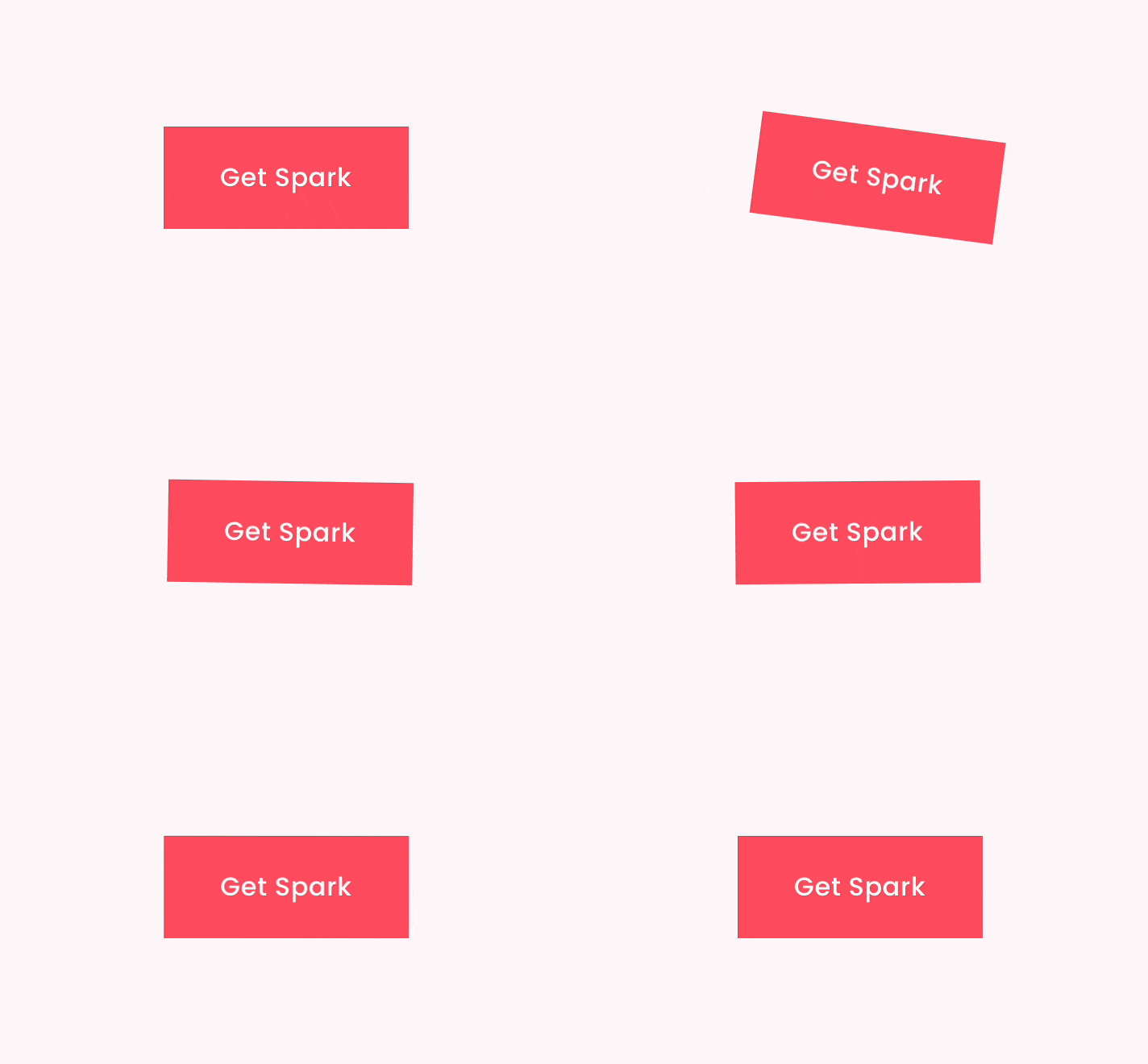
8. Make your button wobble
Sometimes web users need a little bit of a nudge to click on a button. If subtlety isn't your style, you'll want to use the Spark Plugin' wobble attention seeker'.
This button wobbles around to get your customer's attention and encourage them to click. If you want something a little more discreet, you can make your button hover or pulse instead! Check out this cool Squarespace button animation below.
9. Turn your button into a circle
As most buttons are square, if you see a circular button on a Squarespace website, you're going to be intrigued!
This free Squarespace button CSS snippet transforms your buttons into circles and works with small, medium, and large buttons.
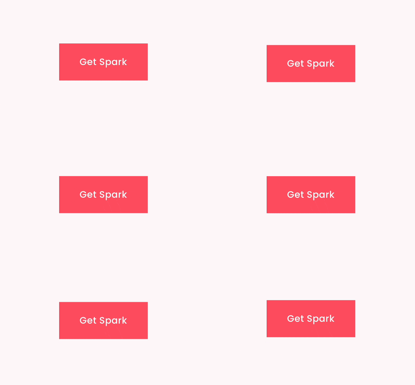
10. Add a hover effect
This Spark Plugin customization adds a gentle hover effect to any button on your website, gently nudging web visitors to find out more.
The great thing about this customization, as with all button customizations by Spark Plugin, is that you can combine the effects together to create a button style that is truly your own!
11. Add a frosted effect to your button
This Spark Plugin customization transforms your buttons, giving them a frosted and blurred effect. It’s excellent if you have a photo background on your page as you can still see the image.
12. Hide a button on mobile
Achieve a more minimalistic mobile site by hiding certain buttons on the mobile version. This customization can be used on any type of block in Squarespace, not just buttons.
13. Make your buttons equal width
One of the issues with Squarespace is that the width of the buttons is based on the length of the text within them. This can lead to mismatched buttons, which can look messy.
This simple snippet makes all buttons on your website the same width, and you can adjust the final width to your liking.
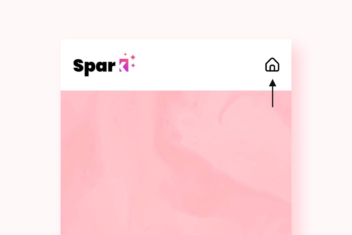
14. Change your mobile menu button
Get a mobile menu button that matches the rest of your Squarespace website design. Select between 9 different icons.
15. Add a back to top button
Not all buttons involve your customers buying something – some exist to make your web users' lives a little easier!
This snippet lets you create a scroll to top button, making it easier for people to get back to the top of your page. Ideal for home pages and long-form blog content.
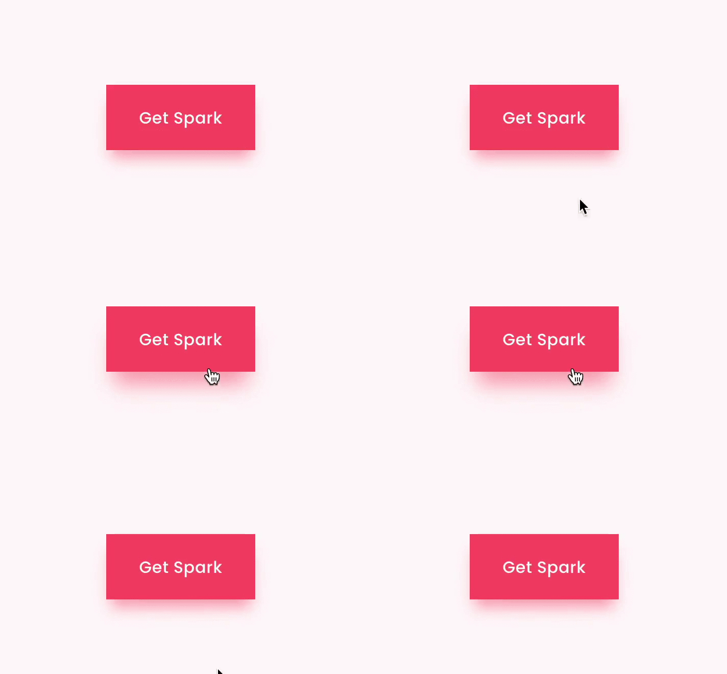
16. Add a shadow to your button
Looking for a subtle way to make your button stand out? A simple shadow can draw the eye and entice the users of your Squarespace website to find out more.
Adding shadows to your website buttons is easy with Spark Plugin, and the benefit is that you can combine the shadow plugin with the other customizations available!
17. Animate your button when someone hovers
Making your button animate when a web user hovers over it can be a powerful psychological nudge. This Squarespace button animation, courtesy of Spark Plugin, offers an outlined button, which fills in when someone rolls over it.
Alternatively, you can make your button change color when someone hovers. Why not try both animations and see which leads to the most clicks for your Squarespace website?
18. Turn your button into a pill
This cool little snippet rounds the corners of your button when someone hovers over it. This adds an element of quirkiness to your site, and the bonus is that it works with all Squarespace templates! It’s the perfect Squarespace button animation for minimalistic websites.
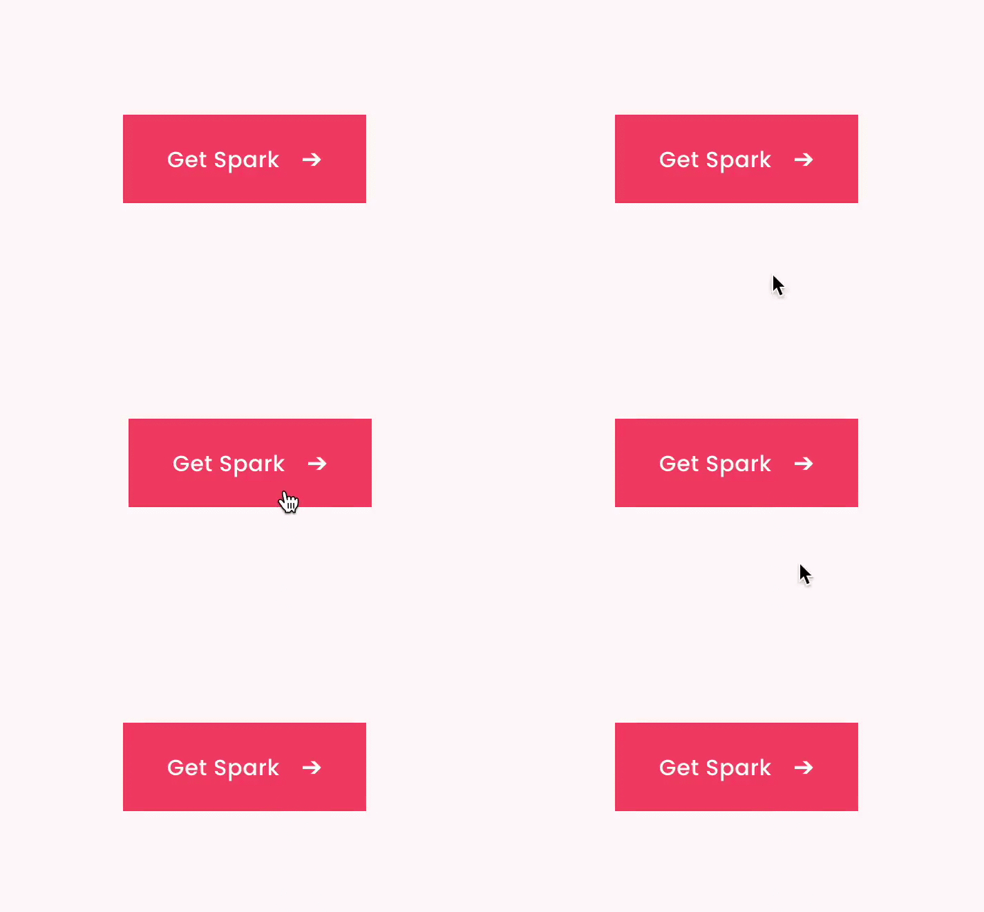
19. Add an arrow
Sometimes the smallest customizations can be the most effective. This Spark Plugin adds an arrow to your button of choice. As the arrow faces forward, it primes the customer and lets them know that if they click, they'll move forward with their lives too!
This plugin also has a very subtle animation in that it nudges in the same as the arrow when someone hovers over it, amplifying the effect.
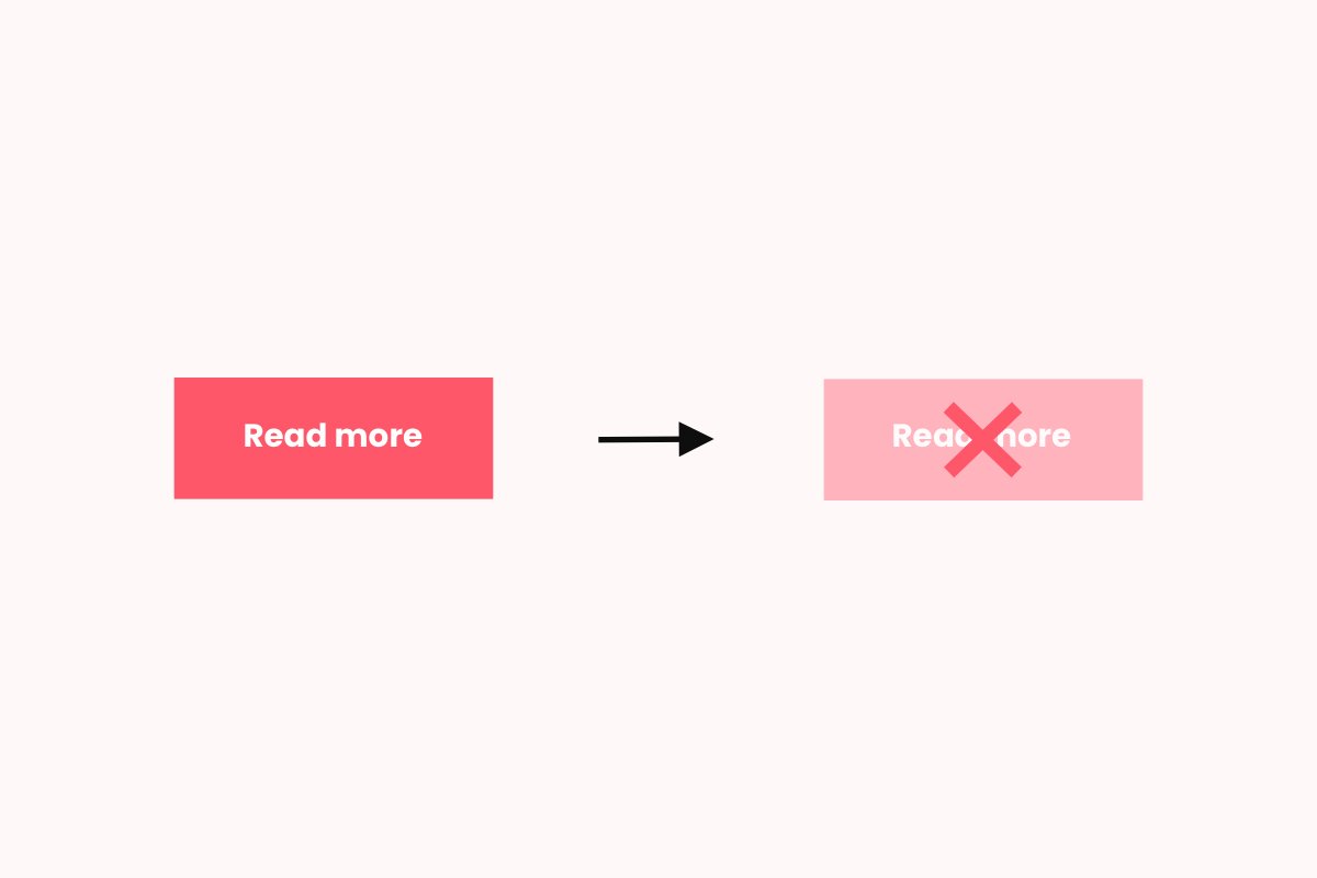
20. Change the button color
Changing the color of the button on your Squarespace site can be a great way to add to incorporate your brand colors into your website. Some people also respond more favourably to buttons when they are certain colors!
Here’s how to change your button color directly in Squarespace. Go to your button block, click the edit button, then click on the design tab.
Next, click on the drop-down button and choose edit button styles. Go to the top of the menu and click site styles. Choose colors and you’ll be taken to a menu where you can choose from a palette of complementary colors, or create your own.
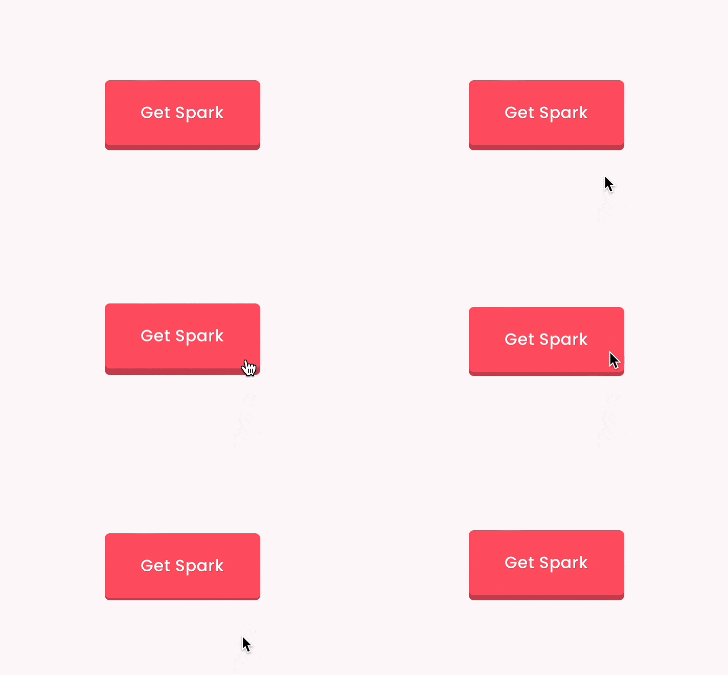
21. Solid shadow button
This Squarespace button CSS adds a new solid style to your buttons, giving them a modern and visually appealing appearance. The solid shadow effect creates depth and highlights the buttons, drawing the user's attention and encouraging interaction.
22. Rotate buttons
Rotating buttons can add flair to your website design, creating a playful or innovative look depending on the angle and context in which it's applied. This effect can be especially intriguing for creative portfolios, unconventional business websites, or any site looking to stand out from the crowd.
To rotate a button in Squarespace, you can add a Squarespace button CSS transformation rule. Below is an example code snippet that rotates a buttons by 15 degrees, or use this rotation plugin.
.sqs-block-button-element {
  transform: rotate(15deg);
}
23. Add a background image
For truly customized buttons that are bespoke to your website, why not add a background image?
This simple tutorial will show you how to do it, and even comes with a video to talk you through the steps.
24. Add variant buttons to your product pages
As you might know, if you have different product variants (for example, colors or sizes), Squarespace defaults to a dropdown menu.
With this Squarespace button CSS snippet, the variant options become their own individual buttons instead. Ideal for making the customer journey easier and increasing sales, especially on mobile.
More Squarespace tweaks
I hope this article has inspired you to customize the buttons on your Squarespace website! Try different types of buttons and see which ones your users respond best to.
I’ve made a huge list of over 100 Squarespace plugins that I continually update. I’m sure you’ll find some tweaks there that you’ll like.
And don’t forget, Spark Plugin is the perfect way to customize different elements of your Squarespace website, without the need for code. Take a look at all the customizations available.


