14 Best Squarespace Font Pairings in 2026
An easy way to keep people on your page? Use a heading and body text that work well together.
The right font pairing can turn a humdrum web page into a work of art!
But… which font pairing do you choose?
We’ve done the hard work for you and have put together 14 of our favorite Squarespace font pairings, alongside why they work so well.
Keep reading until the end, and we’ll reveal another easy way to make the text on your site stand out!
Our favorite Squarespace font pairings
1. Playfair Display and Source Sans Pro
A serif heading always works well with a sans-serif body text, and this particular combination is a classic.
Its elegance makes it an ideal choice if you sell luxury products on your site.
2. Merriweather and Open Sans
Smart and sophisticated, this Squarespace font pairing is remarkably versatile.
Plus you can’t go wrong with Open Sans – it’s the little black dress of fonts – it goes with anything!
3. Lora and Montserrat
This combination shouldn’t work in theory, but it looks absolutely stunning on a website.
The refined header font pairs exceptionally well with the modern body font – ideal for minimalist sites where you want the content to do the talking.
4. Raleway and Roboto
All the Squarespace font pairings we’ve looked at so far have been a combination of serif and sans-serif fonts, but two sans-serif fonts can work exceptionally well too.
Clean and contemporary, this pairing is a popular choice with website developers worldwide.
5. Oswald and Lato
Bold and lively, Oswald and Lato are a match made in heaven.
We love how the two fonts stand out from each other; the tight tracking of Oswald and the relaxed Lato font couldn’t be more different.
6. Poppins and Muli
Sometimes you want a font pairing that’s different, but not too different.
Poppins and Muli are pretty similar at first glance, but when you look a little closer, the pairing is engaging enough to keep your readers on your page!
7. Futura PT and Helvetica Neue
Another classic combination of sans-serif fonts, Futura PT and Helvetica Neue are brilliant if you want something modern but simple.
The sharpness of the header and the softness of the body font are easy to read and look fantastic on any type of website.
8. Crimson Text and Work Sans
This combination is a lot like hot honey on a cheese pizza – the two fonts shouldn’t go together, but they make a brilliant pair!
The elegance of the header combines with the simple body font to make something that’s both classic and contemporary at the same time.
9. Bebas Neue and Nunito
Good font pairings are all about contrast. If you have a header font that’s long and tight, mix it with a body text that’s well-spaced and small.
That’s why this pairing works like it does – the two fonts work together to create something that draws the eye and engages readers.
10. Karla and Proxima Nova
Sometimes you want a font pairing that’s simple, clean, and goes with everything. If this is the case, Karla and Proxima Nova is the pairing for you.
This Squarespace font pairing is brilliant as it scales well; it looks as good on your page footer as it does on a hero image on your homepage.
11. Josefin Sans and Quattrocento Sans
This font pairing is bold and powerful – ideal if you want your words to make an impact.
While this combination is as modern as it comes, it also feels traditional, making it a versatile all-rounder for any website.
12. Alegreya and Cabin
If you want a Squarespace font pairing that’s classic and graceful but uses sans-serif, this combination is a stylish option for any website.
Did you know that tightly tracked fonts can make your words feel more urgent? This combo is great if you want to encourage the fear of missing out in your readers!
13. PT Serif and PT Sans
If you’re new to pairing fonts, a good way to get started is to pair fonts in the same family.
While PT Serif and PT Sans have different styles, they share the same underlying design, meaning they complement each other incredibly well.
14. Abril Fatface and Asap
Quirky and fun, this Squarespace font pairing is a great choice for creatives like photographers and artists.
These two fonts look very different at first glance but share a similar size and tracking, which makes them a powerful combo.
Not sure which Squarespace font pairing to go for?
We’ve looked at 14 of the best Squarespace font pairings, but there are 1,600 fonts to choose from! That’s a lot of different combinations.
If these font pairings aren’t right for your site, just mix and match different heading and body fonts to see which you like best.
Here are over 40 fantastic fonts to get you started.
Don’t forget that the size of your font can also impact how your font pairing looks. Here’s our guide to changing the size of your font in Squarespace.
Bonus! Three fantastic ways to showcase your text
Want a simple, code-free way to transform the text on your website? Spark Plugin makes it easy to enhance your text with a click of a button!
Why not try a…
Gradient heading
This animated gradient is perfect for drawing visitors’ eyes to your content. Plus, you choose the colors, meaning you can create text that represents your brand.
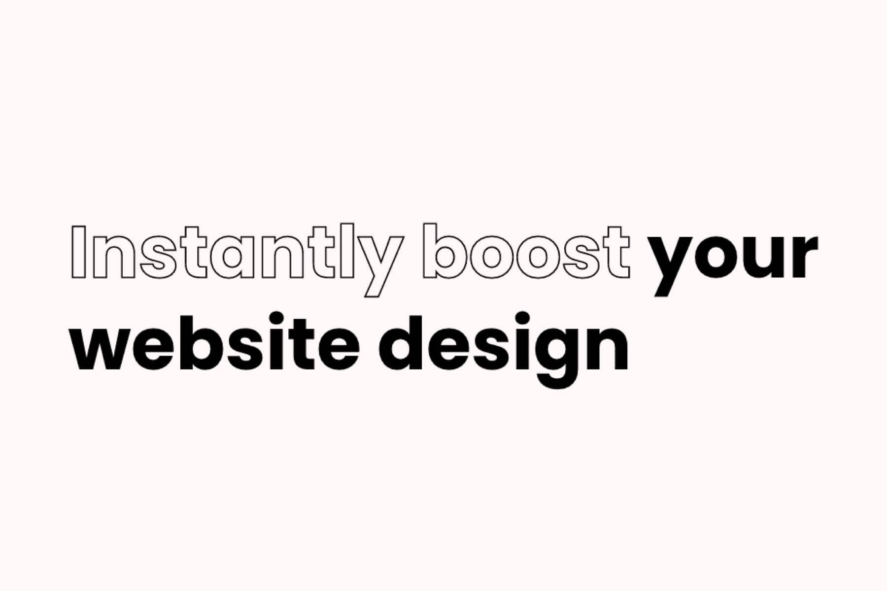
Outline heading
Clean and contemporary, this outline heading is fantastic for getting attention. Use it to highlight a specific word in a sentence or reiterate your call to action.
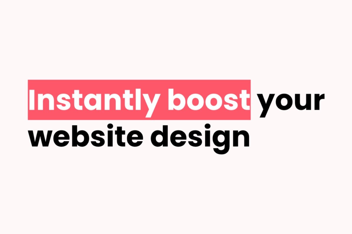
Marker heading
Like a highlighted word on a piece of paper, this nifty customization makes your content stand out on your page. As well as picking the color, you can choose from three different variations.
On top of these, you get over 100 awesome customizations to optimize every element of your site, from your header to your footer!
We hope you enjoyed this guide to the best Squarespace font pairings. Which pairing will you use on your site?


