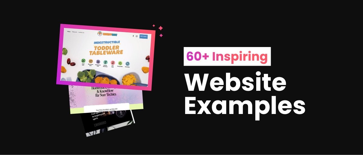
Best Squarespace Websites: 60+ Inspiring Examples in 2025
One of the best ways to get inspiration for your Squarespace website is to look at what other people are doing. Even looking at little things like color schemes, buttons, and backgrounds can be a great way to get out of a creative rut!
Web designers often look at examples of Squarespace websites before starting a project. By finding a website the client likes and using it as a base for the design, they can speed up the design project and deliver a beautiful Squarespace site the client can't wait to use.
If you're developing your own site, I've put together a list of some of the best Squarespace websites to get you started. All examples use Squarespace as a platform, so you know the designs and features are ones you can implement.
I add to this page regularly, so keep coming back to see more awesome Squarespace website examples!
Best Squarespace website examples in 2025
1. MightyMoe Kid's Dinnerware
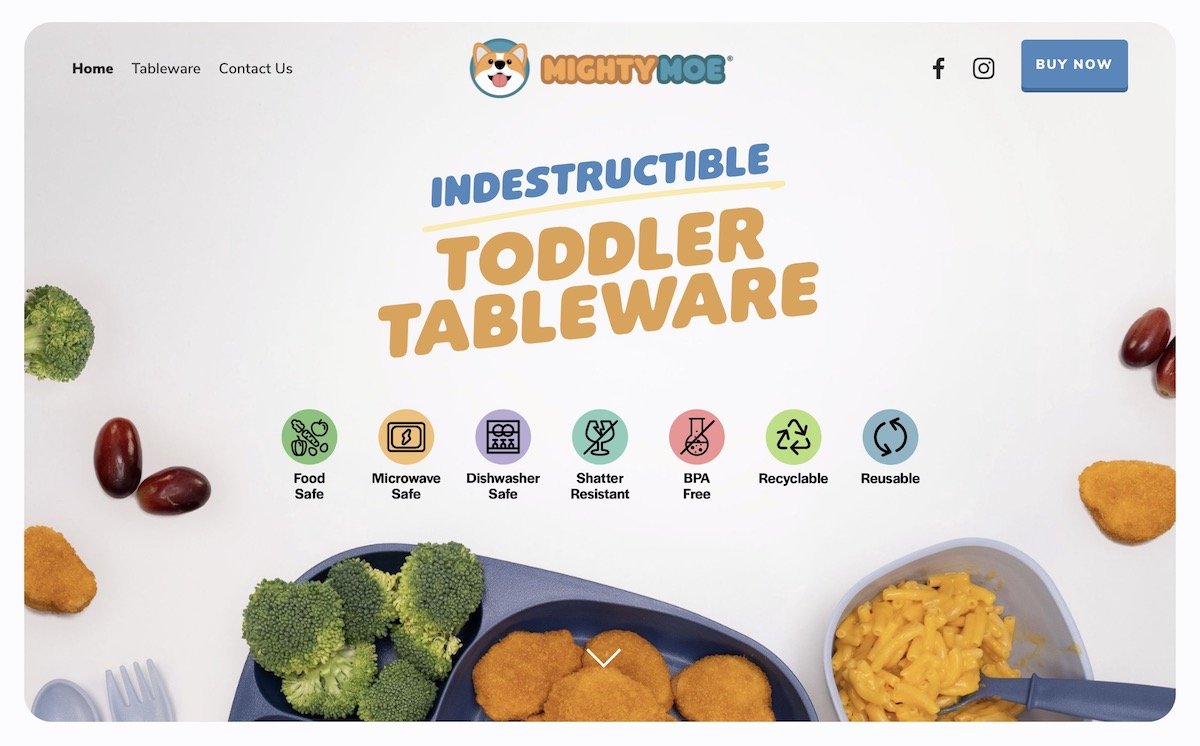
The MightyMoe website is just like its puppy cartoon mascot, cute, colorful, and fun!
Design highlight: This website uses the card lists and carousels customization to great effect on the homepage to tell customers about the products it sells. Plus, you can't go wrong with a powerful and concise call-to-action like 'shop now'!
Tags: Commerce
2. Equipe Planning Lawyers and Consultants
When you're looking for a lawyer to work with, you want to see a professional and bold website. While the funky orange and blue color scheme and strong typography are generally not associated with the legal profession, it makes Equipe stand out in a very traditional marketplace.
Design highlight: The subtly animated backgrounds on the site, created using the animated background image effect, stop the scroll and encourage site visitors to keep reading.
Tags: Services
3. Spark Plugin
Of course, I had to add my own site to this list :) One of the goals of the website was to show as many different Spark customizations to the site as possible.
Design highlight: The animated gradient heading effect is one of the most popular customizations of the plugin. I think that is thanks to its wide use of it on the website.
Tags: Edgy
4. Erin Lyons
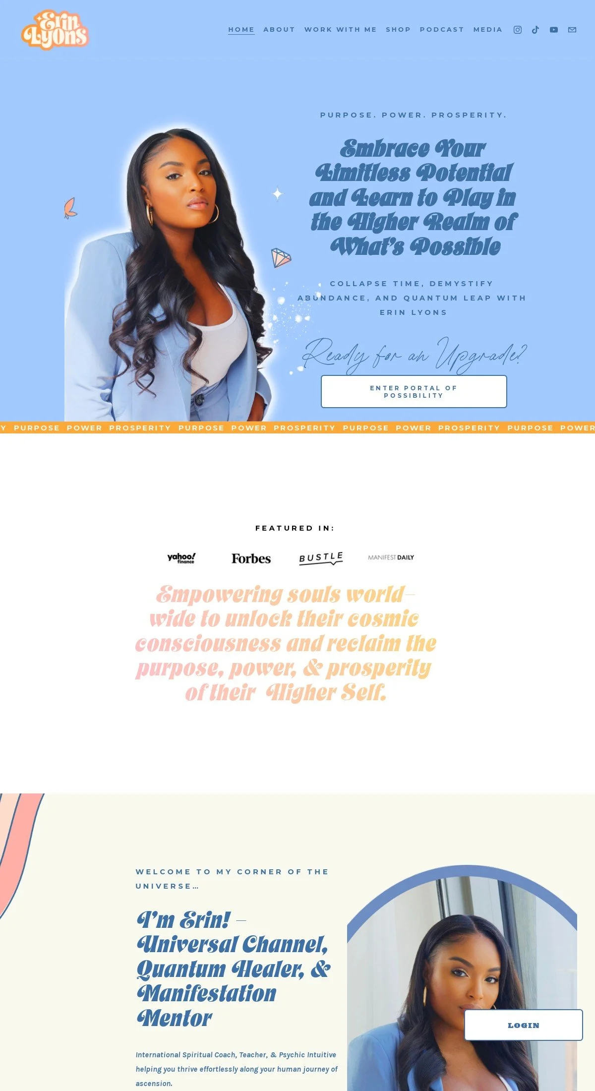
If you want to transform your life, a spiritual coach like Erin Lyons will show you the way! This Squarespace site perfectly shows off Erin's aesthetic and brand, from the animated headers to the pastel icons.
Design highlight: I love the fun yellow heart emoji cursor – I've not seen any other sites with this specific cursor, which makes you bound to remember Erin's website! You can get the same effect on your Squarespace site with the emoji cursor customization.
Tags: Personal
5. Lost Lore Tequila
Lost Lore Tequila prides itself on authenticity and tradition, which comes through on the website. I love the old-style handwritten text, the stunning photos, and the clear and straightforward design. It lets the products speak for themselves!
Design highlight: As this site is a one-page Squarespace website, it makes the most of the section dividers customization to make each part of the site stand out.
Tags: Edgy
6. Powder Me Pretty
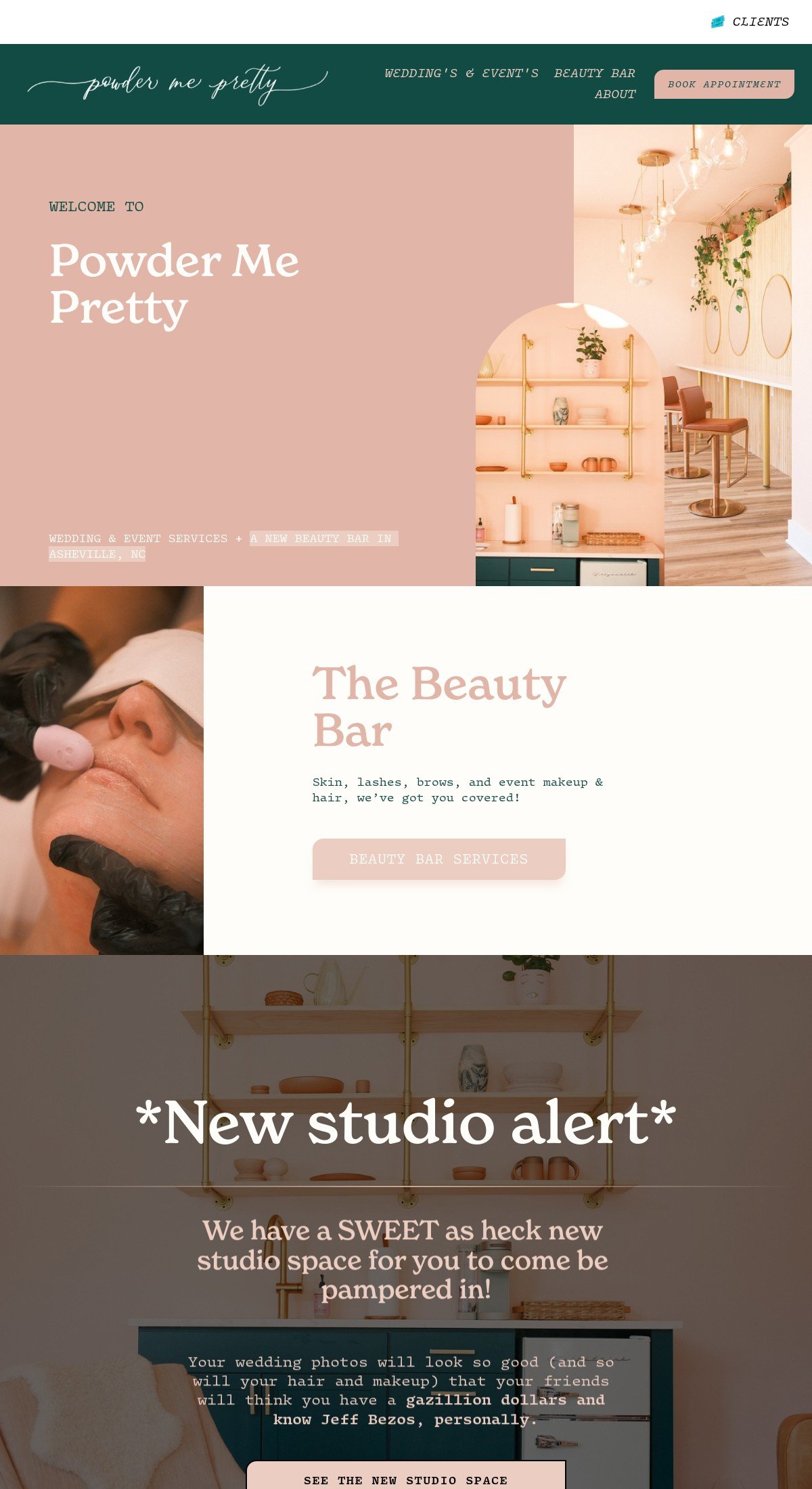
Powder Me Pretty has a cute and quirky color scheme and a chatty and funny tone of voice. If I lived nearby, I'd be booking appointments there all the time!
Design highlight: Squarespace typically applies a gray overlay over images until you hover over them, which is not ideal for a beauty salon. Powder Me Pretty has used the remove image overlay customization so visitors can see all the photos in their bright and stunning beauty.
Tags: Services
7. Bloomington Villas
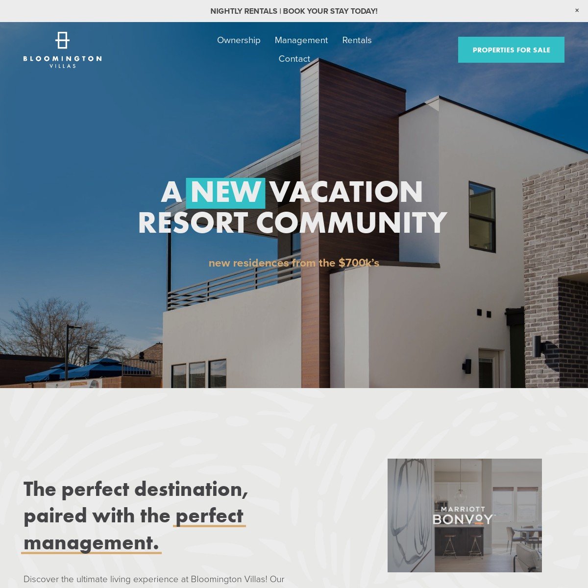
When selling vacation resorts, you need your website to do all the hard work for you. Amazing photos and videos are the order of the day, and there are lots of exciting carousels to check out on the Bloomington Villas Squarespace website.
If you're looking for some extra ways to make your image carousels pop, why not check out my guide to ten amazing carousel styles?
Tags: Edgy
8. Dominic Ruth
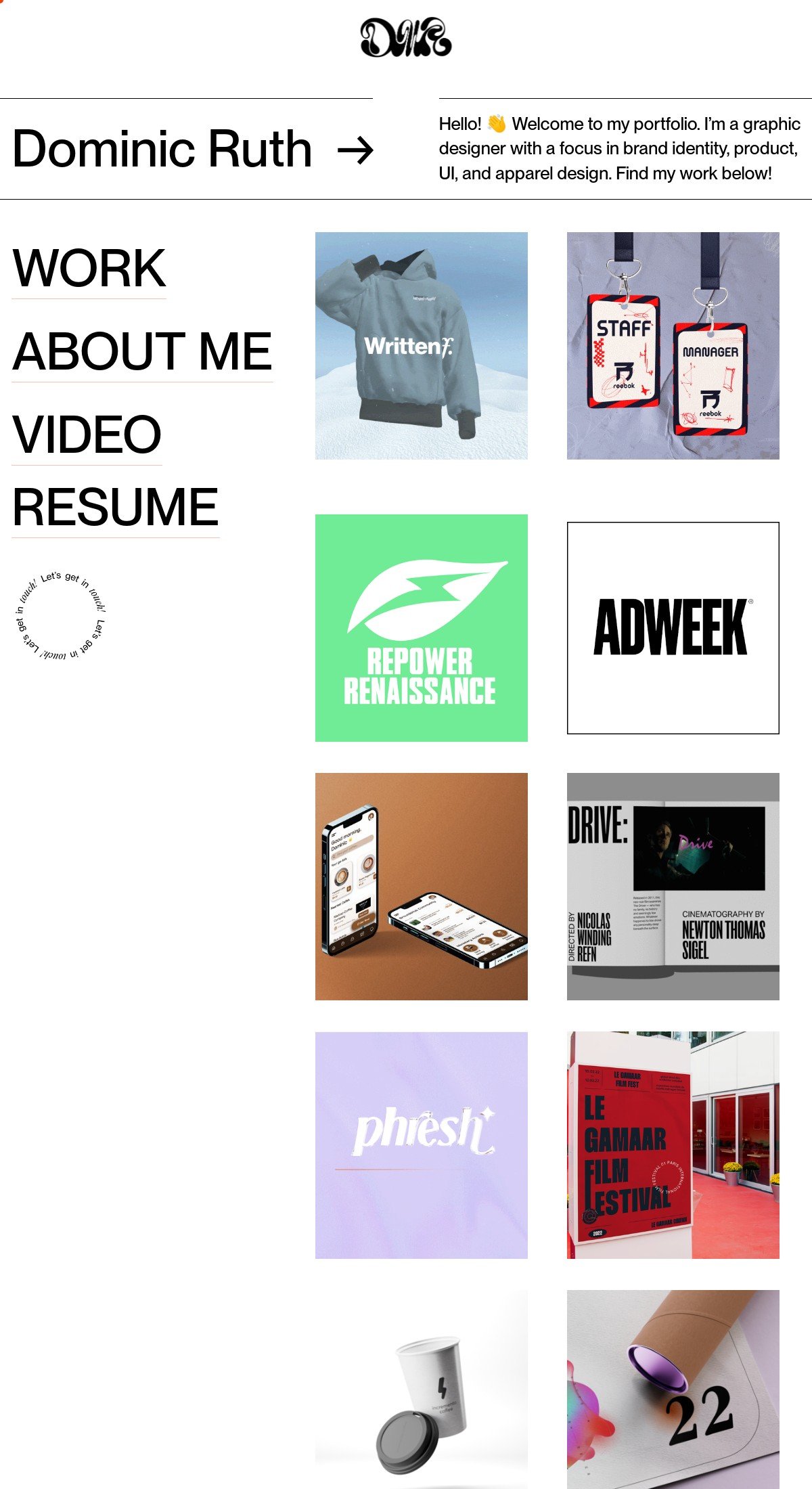
Squarespace isn't just for selling products and services; it's great for showing off your portfolio, like Dominic's graphic design site. I love the fresh and minimalist design and the modern use of emojis.
Design highlight: This website uses the Glassmorphism header customization to add a cool frosted-glass effect, and it complements the site's aesthetic well.
Tags: Personal
9. Pivot Point
I'll be honest; many marketing websites can start to look the same over time. However, with its bright orange and teal accents, fun animated icons, and clever use of white space, the Pivot Point website is highly memorable.
Design highlight: A high-quality call-to-action button is essential for driving leads and conversions. Pivot Point uses the Spark Plugin animated buttons customization to give visitors a gentle nudge, encouraging them to click!
Tags: Edgy
10. Insaan Group
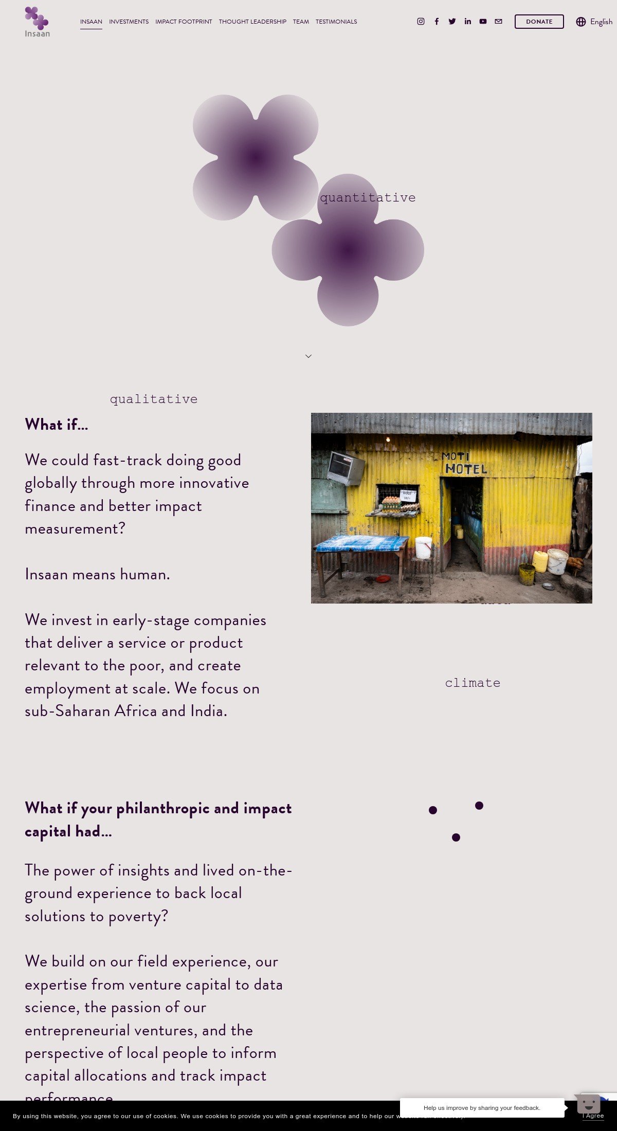
This Squarespace website example gets its point across in a gentle and unobtrusive way, from the softly changing colored background, to the subtly animated symbols.
Design highlight: If you want to implement a similar effect on your new website, why not try the fading background customization?
Tags: Minimalistic
11. Merch Girls
Merch Girls is all about merch and having fun. This is exactly what this cool Squarespace website does, with its playful and colorful design.
Design highlight: One cool effect that the site uses is a show text on hover effect on the “Client work” images.
Tags: Commerce
12. Monarch Athletic Club
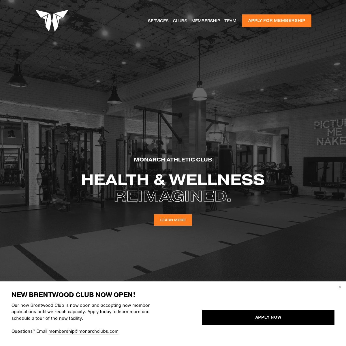
I've always been a fan of monotone websites with pops of color, and I love the bright dashes of orange on this site. It looks clean and professional, but inspirational and powerful at the same time.
Design highlight: This website uses the text style customization to create headers that stand out. The outlined text is incredibly dynamic, the perfect choice for a gym chain!
Tags: Services
13. Brookelynn Landis
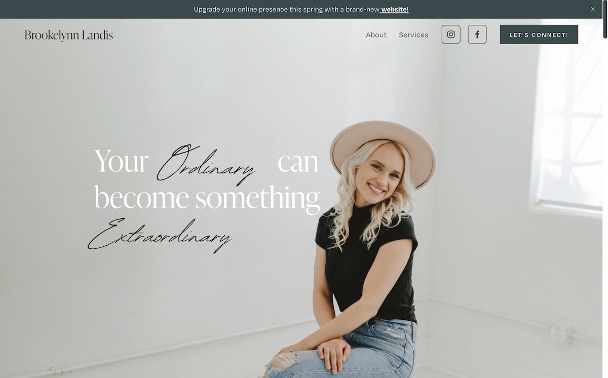
Brookelynn provides web design services, and I love the crisp, clean design of her own professional site. She takes advantage of many of Squarespace's features and showcases them on her pages.
Design highlight: High-quality, eye-catching images are essential for an exceptional website, and Brookelynn uses the animated image shapes customization to fantastic effect.
Tags: Personal, Minimalistic
14. MyForest Foods
Plant-based living is becoming increasingly popular, and MyForest Food prides itself on its vegan bacon made from mushrooms. As you might expect from a brand that specializes in sustainable foods, MyForest Foods uses a lot of natural muted tones on its website, alongside many delicious-looking photos of the products it sells.
Design highlight: This Squarespace website example uses a strong call-to-action button to encourage curious customers to find out more. The animated buttons customization is perfect for enticing clicks and boosting sales.
Tags: Commerce
15. Square Launcher Golf
The first thing your eyes are drawn to when you visit the Square Launcher Golf site is a lot of impressive logos, including the Professional Golfer's Association and the Patent Office logo. This gives you peace of mind that you're checking out a fantastic, high-quality product.
Design highlight: One really cool thing I like about this Squarespace website is that a handwritten-esque line is drawn under the headers as you scroll down the page. It's very reassuring and highlights the words the brand wants you to focus on!
Tags: Commerce
16. SwayNYC
The Sway NYC website is part home page and part landing page, with the main aim of getting you to download its mobile app. A prominent call-to-action, combined with lots of videos of recent events and testimonials from happy customers encourages you to sign up.
Design highlight: This Squarespace example uses a color block with an animated gradient background. Scrolling from black to red, it draws your eye and ties perfectly in with the cool aesthetic of the website.
Tags: Edgy
17. Balazs Fodor Photography
This website showcases lots of stunning ocean photography; and gives part of its profits towards ocean conservation causes, which is fantastic! This Squarespace website is very minimalist, meaning you focus on all the lovely photos that are for sale.
Design highlight: When you have a long webpage, you want to encourage your visitors to keep scrolling all the way to the end. The scroll indicator customization helps keep people on your page and discover your call to action.
Tags: Minimalistic
18. Planner Girl Hub
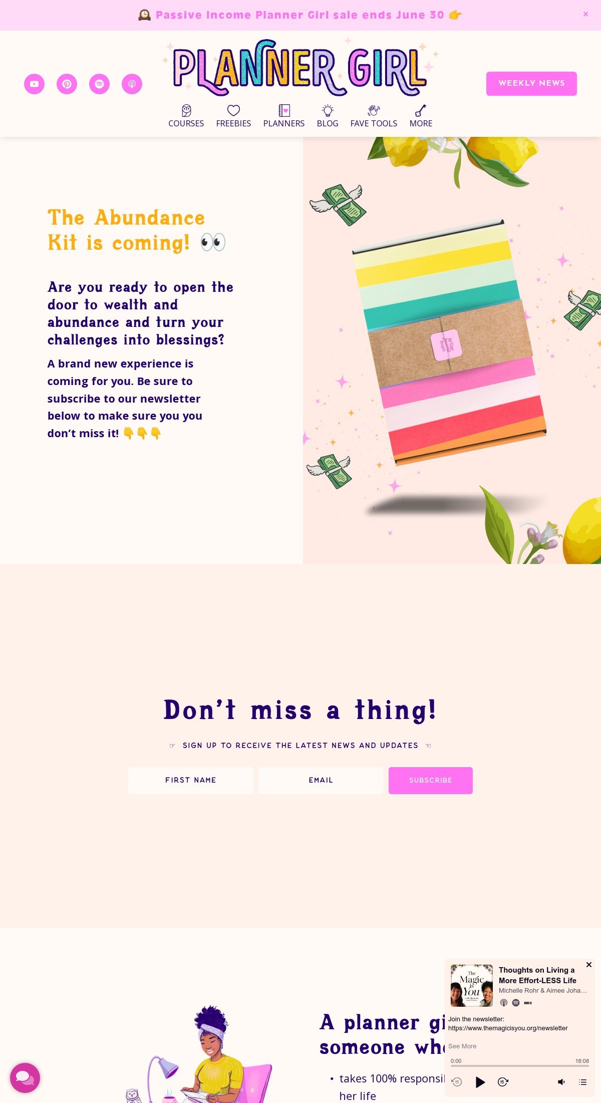
The Planner Girl Hub is sparkly, bright, and full of valuable information when it comes to getting organized. Michelle has definitely researched her target audience and created a fun and funky website that grabs their attention.
Design highlight: The accordions on the Planner Girl Hub website have a handwritten header that makes them stand out and entices web visitors to find out more about the business. If you want to enhance the accordions on your Squarespace website, the accordion styles is a brilliant way to do this.
Tags: Edgy
19. Burningred
A UK-based digital marketing agency, Burningred has an impressive portfolio. When you deal with many different clients, it's vital to show off the work you've done for them!
Design highlight: Burningred uses the gallery shadow effect to make a real impact. This engages views, tempting them to click through and read more about the amazing work the team has done.
Tags: Services
20. De Baere Wholesale Bakery
Who doesn't love a tasty cake or a slice of bread? De Baere's delicious products are front and center of this Squarespace website, with lots of vivid photos and cute images to get people's mouths watering.
Design highlight: A well-maintained social media presence is essential when you work in the food industry – no doubt you'll have lots of yummy images to share! De Baere uses animated social icons to draw attention to its social media accounts.
Tags: Commerce
21. DIFFA Dallas
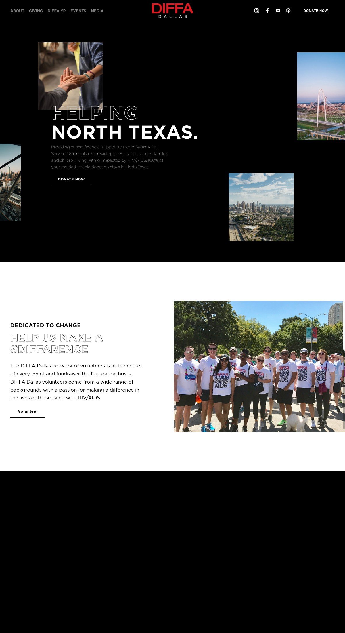
Squarespace is great for charitable organizations like Diffa Dallas. They've kept their website nice and clean, with a stunning black and white design containing flashes of red.
Design highlight: DIFFA Dallas has kept it simple with a clear yet striking call-to-action button, encouraging potential patrons to learn more about them. The animated underline is provided courtesy of Spark Plugin's custom button styles.
Tags: Edgy
22. Harper Sunday
When you're a graphic designer, you want a Squarespace website that showcases your unique style and shows off the work you've done for your clients. The design of the Harper Sunday site is very eclectic and retro, but it comes together really well!
Design highlight: I love the rounded text blocks on this Squarespace site – they make the content pop and add to the overall quirkiness of the website. You can add the same effect to your site with the inset background border.
Tags: Personal, Edgy
23. Hearth + Home
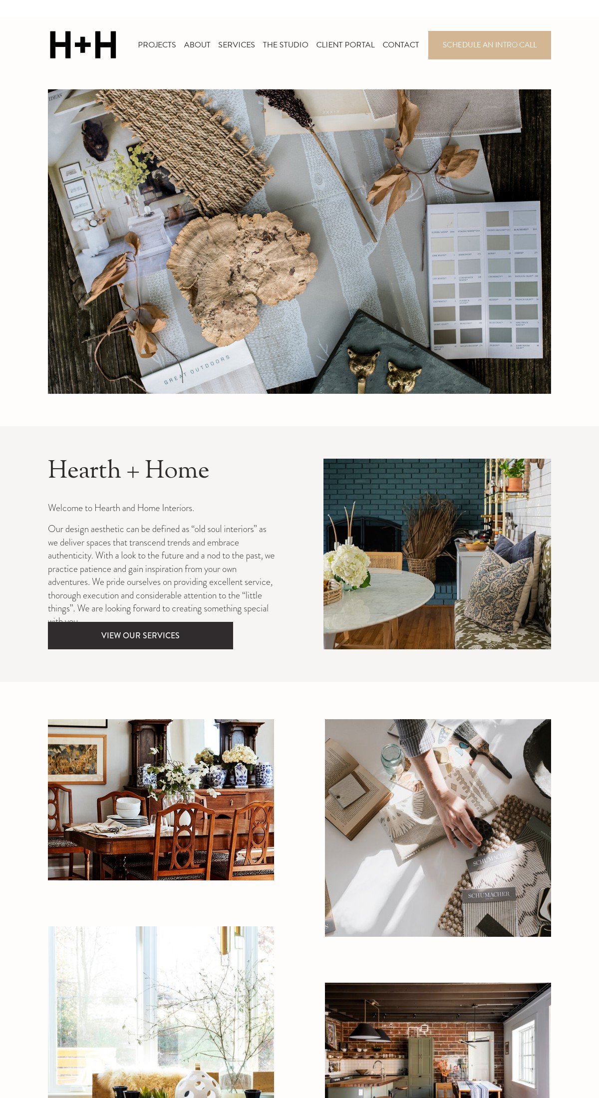
Hearth + Home specializes in 'old soul' interior design, and the website perfectly demonstrates its brand. Muted colors, serif fonts, and lots of photos mean you know exactly what you will get if you use this company.
A before and after section is perfect when you work in interior design, and there are a lot of amazing transformations on this site! If you want to create your own before and after image slider, why not check out my easy tutorial?
Tags: Services
24. Hype Network
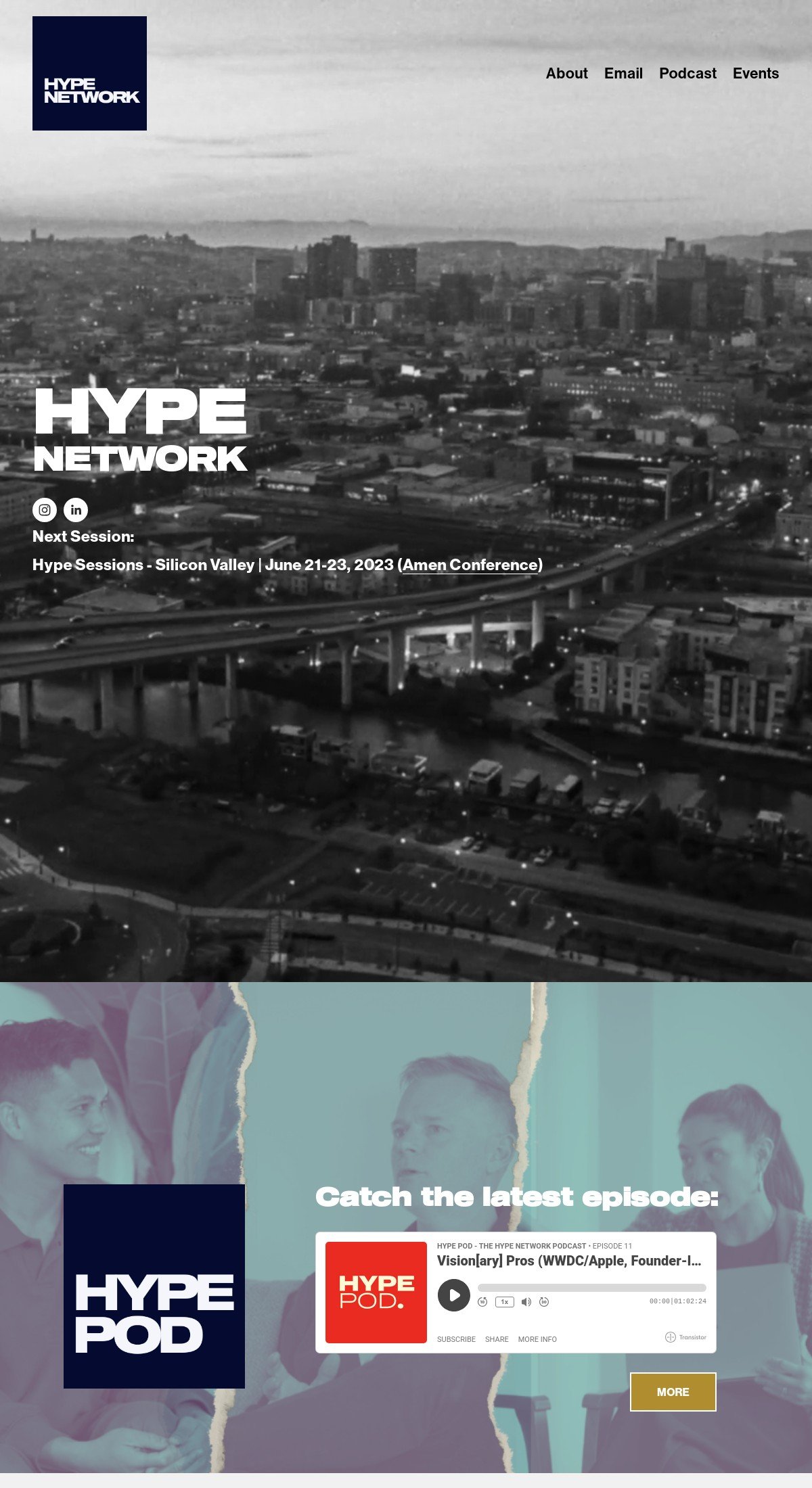
The Hype Network wants strong-minded, independent thinkers to join its network, and the website design is bold, powerful, and unapologetic. The bold, wide typography and black and red colorway are excellent choices for this brand.
Tags: Edgy
25. Kolea
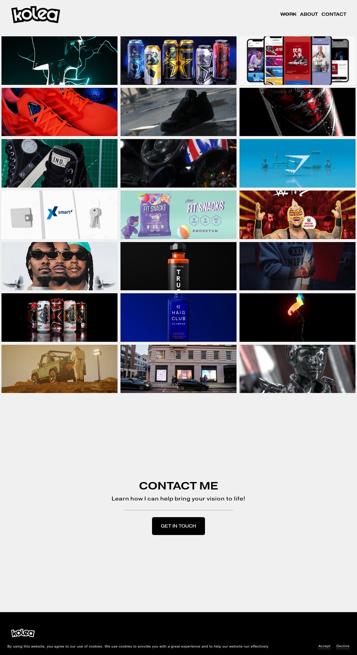
Another perfect example of how Squarespace is fantastic for freelance designers, the Kolea website has an impressive portfolio which you see as soon as you visit the homepage.
Design highlight: A cool feature of this site is that if you hover over the images, you get an overlay saying who the work was for – this saves space and is incredibly impactful. You can add a similar effect to your website with the hover reveal customization.
Tags: Personal, Services
26. Live Bold Live Beautiful
This Squarespace website is very floral and very friendly. If you're looking for a life coach or someone to help you through stressful times, this site will put you at ease!
Design highlight: The underlined headers in a complementary color works a treat here – they make the different sections stand out and encourage you to read more. You can add these headers to your own site with the text styles customization.
Tags: Personal, Services
27. Spera Special Events
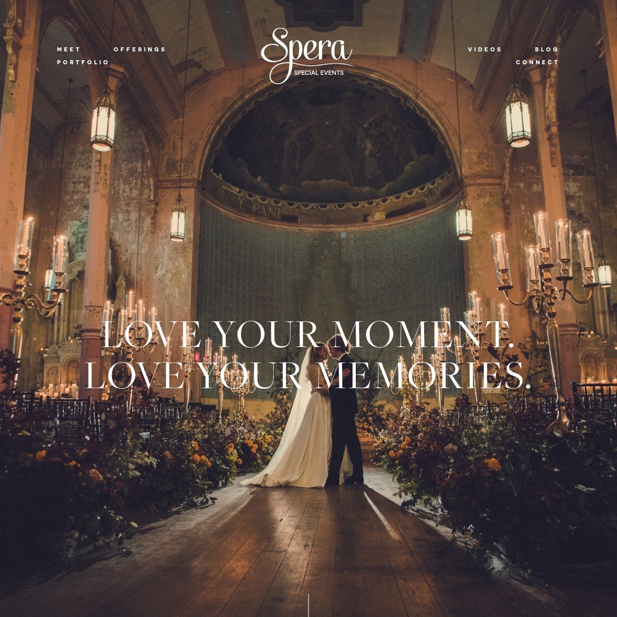
The Spera Special Events website is gorgeous – lots of inspirational photos and videos, a stunning cornflower blue color theme, and testimonials from satisfied customers.
Design highlight: I love the testimonial slider on the home page – the images overlay with the text in such a smooth and seamless way; it makes me want to read them all!
Tags: Services
28. Meletius Coffee Roasters
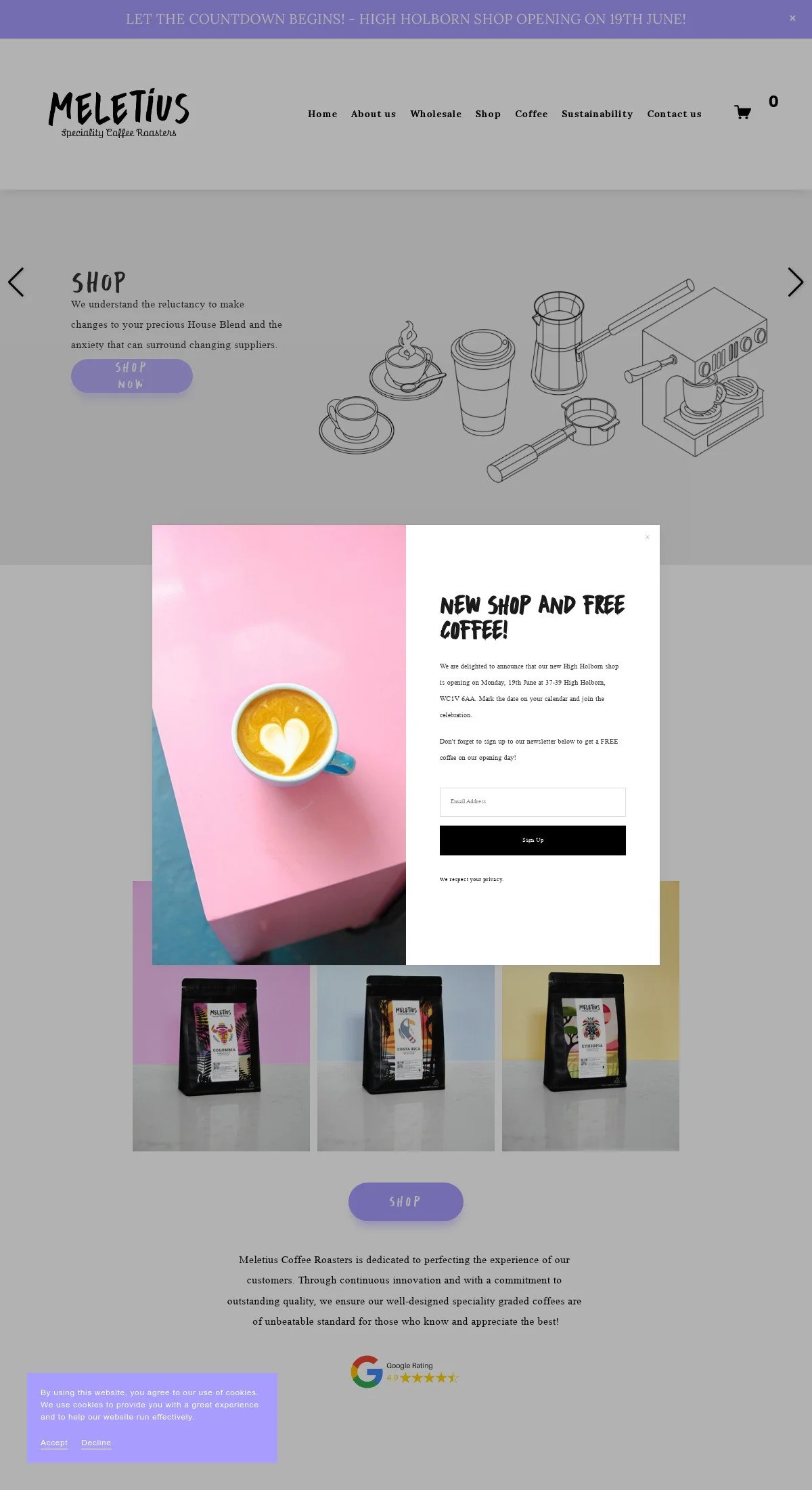
If you're a Squarespace web developer, you'll undoubtedly drink a lot of coffee to get you through the day! The attention to detail on this website is incredible, with lots of line drawings, flashes of violet, and information about how the business operates.
Design highlight: The little coffee cup cursor is a super-cute touch! You can create your own stylish cursor with the emoji cursor extension.
Tags: Commerce
29. State of Flow
The first thing that stands out on this website is the unique animated background image that looks a little like a rainbow, or the colours of an oil spill. This background juxtaposes the black-and-white photos so well!
Tags: Edgy
30. The Foundry Campus
This website is really well done; it's functional, well-thought-out, and has lots of great photos. It's so easy to navigate that it doesn't even need a header to point you in the right direction!
Design highlight: This Squarespace website lists all the partners the Foundry Campus works with on the homepage. It's a great use of the card list feature that Spark Plugin offers.
Tags: Minimalistic
31. Sustainable Northwest
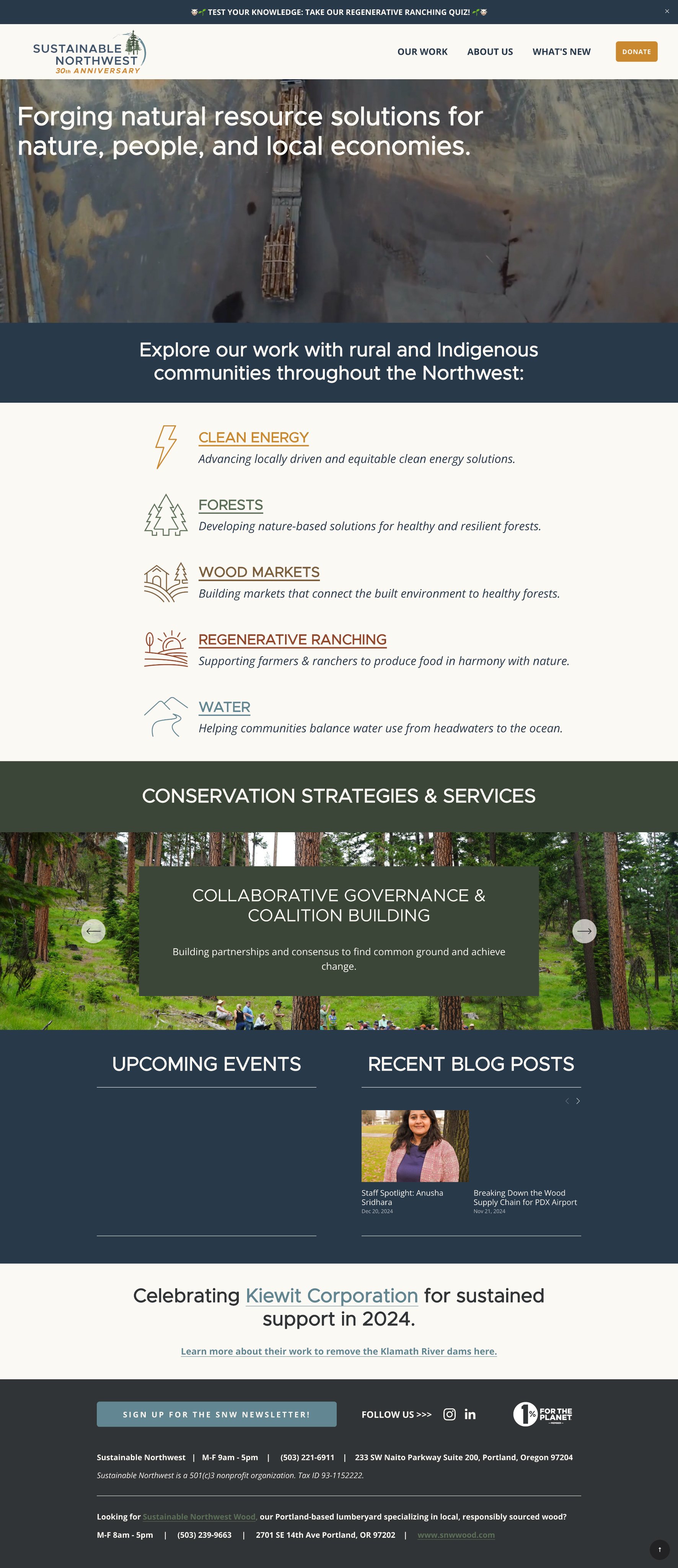
Sustainable Northwest has a beautifully filmed video on their homepage that grabs your attention right away and sets the tone for their dedication to environmental solutions.
Design highlight: I love how Sustainable Northwest uses an announcement bar to feature a Squarespace quiz. Positioned right at the top of the site with fun emojis, it's a creative way to highlight their work and encourage visitors to learn more.
Tags: Non-profit
Visit the site
32. Marty Neumeier
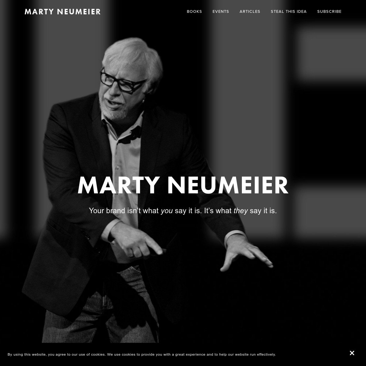
A grayscale website isn't for everyone, but it shows you have authority and impact when done right. This site shows Marty's skills as a brand specialist and tells you everything he can do for your business in a handful of pages.
Tags: Personal
33. Binging with Babish
This is a fun site, where Andrew, the chef behind the site, cooks food inspired by TV shows! The videos are well worth a watch.
As there's a lot of content, the website has a search bar so you can look for the exact information you want. This is an excellent option for improving the navigation of your website.
Tags: Personal
34. NEW INC
When you have an incubator programme you want people to apply for, it's vital that your site is clear to navigate and gives them all the information they need to come on board.
The great thing about this site is that it tells you the purpose immediately – no need to waste time searching for information and getting confused. That's what good design should be all about.
Tags: Minimalistic
35. Fighting Eel
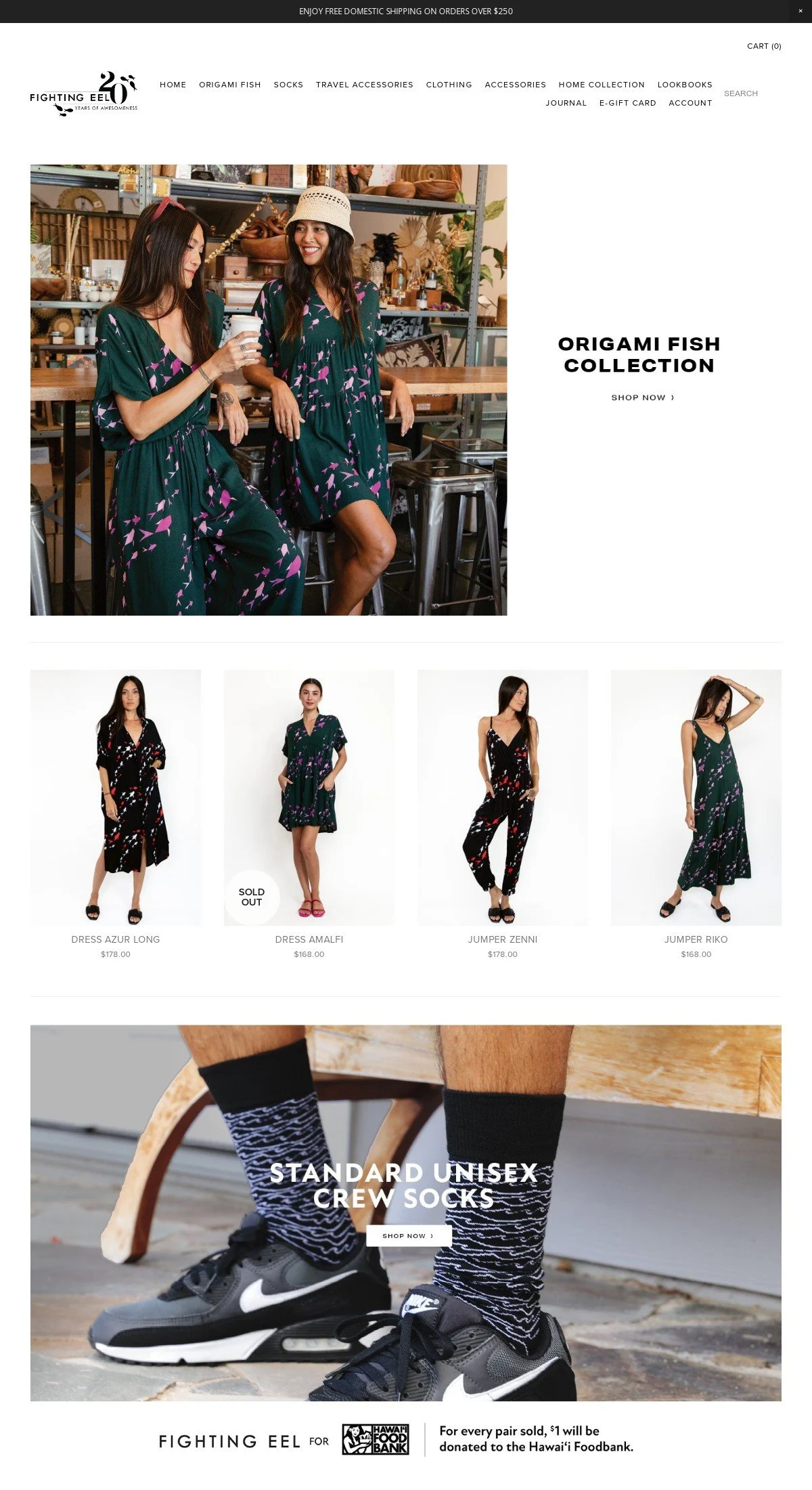
Squarespace is great for eCommerce as you can easily link up your payment portal of choice and show off many amazing photos of your products.
What I like most about the Fighting Eel eCommerce store is how easy it is to navigate. Everything is accessible from the navigation bar, and subsections are listed clearly on the left-hand side of the page.
Tags: Commerce
36. Darren Booth
This Squarespace site is clean and clear, meaning the brightly colored artworks stand out. I love the site's work section layout – everything is bundled together with no white space. This would typically look messy, but it works well here!
Tags: Personal, Commerce
37. Blue Dog NYC
I like this website as it details what you can expect when you visit this venue – with lots of lovely photos and a mouth-watering menu. There are many great places to eat in New York, so you want your site to stand out from the crowd!
Tags: Minimalistic
38. Studio Joho
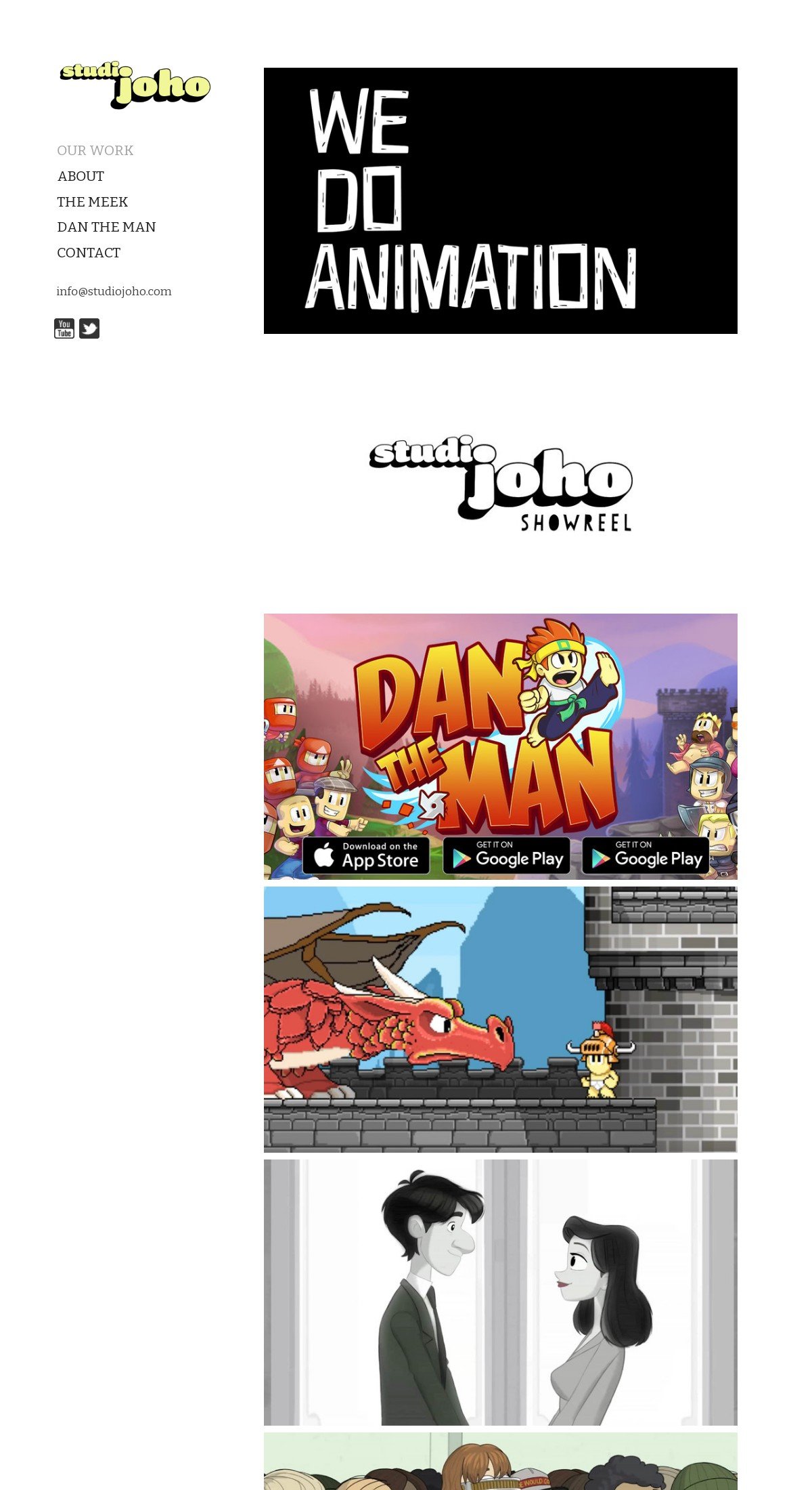
This design studio website proudly displays its portfolio on the front page. An unusual feature is that this Squarespace site has its navigation on the left-hand side of the page rather than the top, which is more traditional. This savvy design choice means the navigation is easy to scan and locate.
Tags: Personal
39. Egg Shop
This Squarespace website example is making me hungry! Egg Shop has so much functionality – you can buy gift cards, check out the menu, book a private event, and even buy merchandise.
Despite having lots of pages, the site is still clean and easy to work your way around – and I love the cute food-themed background!
Tags: Commerce
40. Altrock Surfaces
Some products are easier to sell than others, and let's be honest, marble surfaces aren't the most exciting things to promote! However, the photography on the Altrock website is exceptional and is complemented by a crisp and clean website design that shows off what the products can do.
Tags: Commerce, Minimalistic
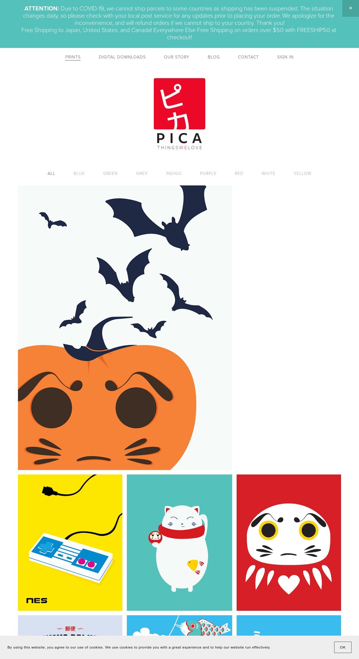
41. PICA
The prints on this website are so cute! The PICA site uses a risky approach in that the homepage simply shows off the products you can buy, without explaining what the business does or its values.
However, it works!
Tags: Commerce
42. Daniel Arsham
The first thought when I visited this website for the first is… 'it's certainly chaotic'. The site is strange to navigate, and when you don't carry out any actions for a few sections, a video starts playing!
This would typically not be considered great UX, but if you're into Daniel's art and are his target audience, it's probably right up your street!
Tags: Personal, Services
43. Honeybear Bake Shop
Honeybear not only has one of the best Squarespace websites 2024, but it also has one of the best cookies this year (according to BOB).
Tags: Commerce, Services, Edgy
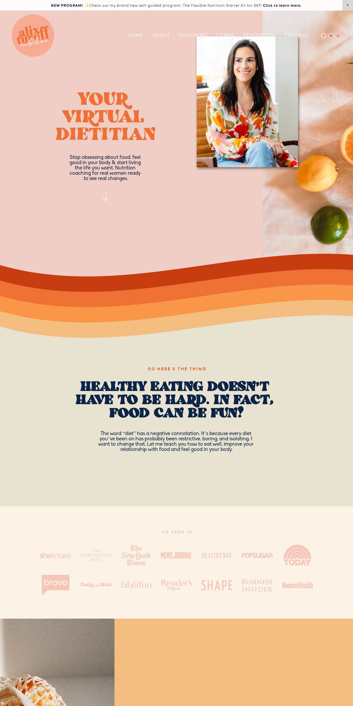
44. Alix Turoff Nutrition
When you want to eat healthy, you need to eat bright and vivid foods. So if you're a dietitian, you should have a bright and vivid website! I love the 70s-inspired typography, the retro rainbow dividers, and the fresh photos on this Squarespace website.
Tags: Personal, Services
45. MoonWise
MoonWise has made a cool Squarespace website with side-by-side sections. This feature isn’t included in Squarespace, but there are many guides on how to do it.
Tags: Commerce, Minimalistic
46. It's Hey Founders
This site has a clever use of the vertical header to give a unique look of their Squarespace website.
Tags: Services
47. Powerhouse
With a light and clear design, Powerhouse is a great example of a Squarespace website that can be used in many different industries.
Design highlight: The animated card design at the bottom of the page makes it look even more professional.
Tags: Minimalistic
48. Rachel Holly
Another impressive Squarespace website sample is the website of Rachel Holly. It uses the popular color palette of beige, white, and black, and does so in a stunning way.
Tags: Personal, Minimalistic
49. Tiny Coast Digital
3D website designs trended last year, and Tiny Coast Digital is one of the Squarespace websites that used this design very well.
Design highlight: To adapt to all the vibrant colors that the website has, it uses an adaptive logo to automatically change the logo from dark to light.
Tags: Edgy, Services
50. Mike Foster
For those of you searching for the best Squarespace websites in 2024, Mark Foster is a website that’s hard to miss. It is a popular Squarespace website that has been featured multiple times.
The website has a clever use of backgrounds, which gives this overlapping effect.
Tags: Personal, Commerce
51. HRM Software
We all know that Squarespace is popular among small businesses, but it is used by some larger companies too.
Design highlight: Many find it difficult to customize lines in Squarespace, but HRM Software uses a custom line style customization to solve this on their site.
Tags: Services
52. Bembien
Bembien offers a range of high-quality stunning photographs.
Design highlight: At the start of the homepage, it elegantly uses an inset background to give the site some extra character. The background of inset backgrounds are white by default in Squarespace, but with this customization, you can change the color.
Tags: Minimalistic, Commerce
53. Holistic Academic Development
This cool Squarespace website has uniqueness thanks to its use of borders. The borders are repeated throughout the whole website design to maintain consistency.
Design highlight: The site also uses many side-by-side sections.
Tags: Edgy, Services
54. Simple Time Tracker
This website should be called “fifty shades of green”. It has green images, text, logos, and backgrounds.
Not all Squarespace websites can be as consistent with imagery as Simple, but if you do it is a good idea.
Design highlight: Even though the website design looks great, this website could improve by adding an attention seeker effect to the buttons.
Tags: Minimalistic
55. Kurly Creative
Kurly Creative is one of those Squarespace websites that has a lot going on, but it just works. This is thanks to the reuse of colors, typography, line designs, and shapes, throughout the site.
Design highlight: I can’t stop staring at those cool buttons that Kurly added to the site. Here’re some similar animated buttons that you can add.
Tags: Personal, Edgy
56. Ella House Studio
This Squarespace website is one of the most minimalistic Squarespace website examples and an example of how free space is your friend. Leaving some parts of the design blank is an excellent idea, and will make your website design look more professional.
Website content has slowly started to get larger over the years, but Ella House Studio is a good website example of one that still uses smaller fonts.
Speaking of fonts, here’s a list of my best fonts in 2024.
Tags: Minimalistic, Services
57. ChangeLab
WordPress is popular among SaaS websites. ChangeLab shows that you can make a just as good SaaS website with Squarespace.
Design highlight: This image changer plugin works similarly to the one ChangeLab uses.
Tags: Edgy
58. Wild Haven Studio
Another stunning Squarespace website example.
Design highlight: Wild Haven Studio effectively uses scroll indicators as part of its Squarespace website design.
Tags: Minimalistic, Commerce
59. Chef Denise
Chef Denise offers one of the best Squarespace websites this year. A beautiful palette combined with cool stroke headings makes this website gorgeous.
Tags: Edgy
60. Simple Sacred Spaces
Another stunning example of a Squarespace website that does so many things right. Colors, typography, and sizing, all play together very well.
Design highlight: Some Squarespace animations could probably spice up this cool website design even more.
Tags: Minimalistic, Commerce
So… what do you think of the best Squarespace websites 2025?
I hope my best Squarespace websites got you inspired. Taking inspiration from others is one of the best ways to increase the overall quality of your website.
To further improve your site, you should check out my favorite Squarespace plugins and custom Squarespace templates.

