100+ Squarespace CSS Codes: The Ultimate Cheat Sheet

Want to take your Squarespace design to the next level? This Squarespace CSS cheat sheet has you covered!
Below, you’ll find 103 Squarespace CSS codes to fine-tune every detail of your site.
Use the filter to quickly grab the perfect snippet.
Let’s get started:
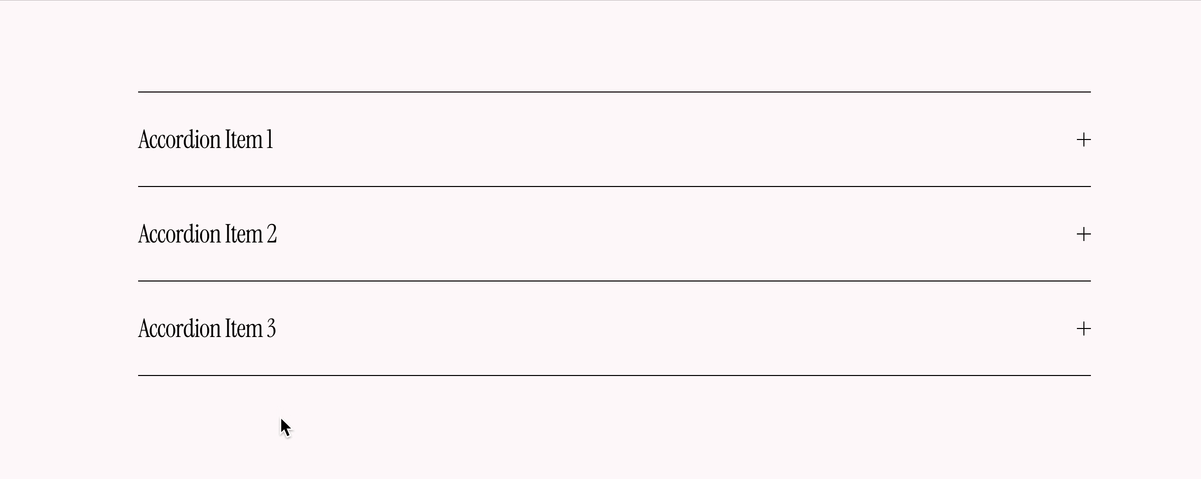
1. Solid shadow button
Get a new style on your buttons.
More options: Customize every detail of your buttons with this plugin.
Tags: Button
Customize: Change ‘rgb(255, 87, 106)’ to the color of your choice.
CSS snippet:
.sqs-block-button .sqs-block-button-element {
  box-shadow: 7px 7px rgb(255, 87, 106);
  transition: 120ms !important;
}
.sqs-block-button .sqs-block-button-element:hover {
  box-shadow: 4px 4px rgb(255, 87, 106);
  transform: translateY(2px) !important;
  opacity: 1 !important;
}
.sqs-block-button .sqs-block-button-element:active {
  box-shadow: none;
  transform: translateY(4px) !important;
}
2. Vertical lines

This Squarespace custom CSS adds vertical lines in Squarespace as default, instead of horizontal.
More options: Get complete control over your lines with this plugin.
Tags: Misc, Popular
Customize: Change ‘width’ to increase the width, and change ‘height’ to increase length.
CSS snippet:
hr {
  width: 1px !important;
  height: 100px !important;
}
3. Change dropdown menu color

Now you can change the dropdown menu color.
More options: Looking for more dropdown menu options? Try this plugin.
Tags: Navigation
Customize: To change color, change the rgb values to your liking.
CSS snippet:
.header-nav-folder-content {
  background-color: rgb(255, 87, 106) !important;
}
.header-nav-folder-item a {
  color: rgb(255, 255, 255) !important;
}
4. Header line

This Squarespace CSS code adds a simple straight line to your header.
More options: Customize every detail of your header with this plugin.
Tags: Navigation
Customize: To change color, change the rgba value to your liking.
CSS snippet:
#header {
  box-shadow: 0px 0px 1px 0px rgba(170,170,170,1) !important;
}
5. Animated links

Adds a cool animated marker effect when hovering links.
More options: Check out this plugin for endless link styling options.
Tags: Animation, Typography
Customize: To change color, change the rgba value to your liking.
CSS snippet:
.sqs-block-html a {
  text-decoration: none !important;
  box-shadow: inset 0 -1px 0 0 rgba(255, 87, 106, 0.3) !important;
  color: inherit !important;
  transition: box-shadow 200ms !important;
  background-image: none !important;
}
.sqs-block-html a:hover {
  box-shadow: inset 0 -12px 0 0 rgba(255, 87, 106, 0.3) !important;
}
6. Gradient backgrounds
A gradient background is a fantastic way to create an eye-catching effect on your Squarespace website. It’s awesome if you want to show off your brand colors on your home page or about us section!
You can use this Squarespace CSS code to change the gradient color of your entire Squarespace site. Check out this plugin if you want to add a gradient to an individual section.
More options: Customize every detail of your gradient background with this plugin.
Tags: Animation, Layouts
Customize: To change color, change the hex colors to your liking.
CSS snippet:
.site-wrapper {
background: linear-gradient(-45deg, #ff576a, #b81bef) !important;
}
.page-section, .section-background {
background: transparent !important;
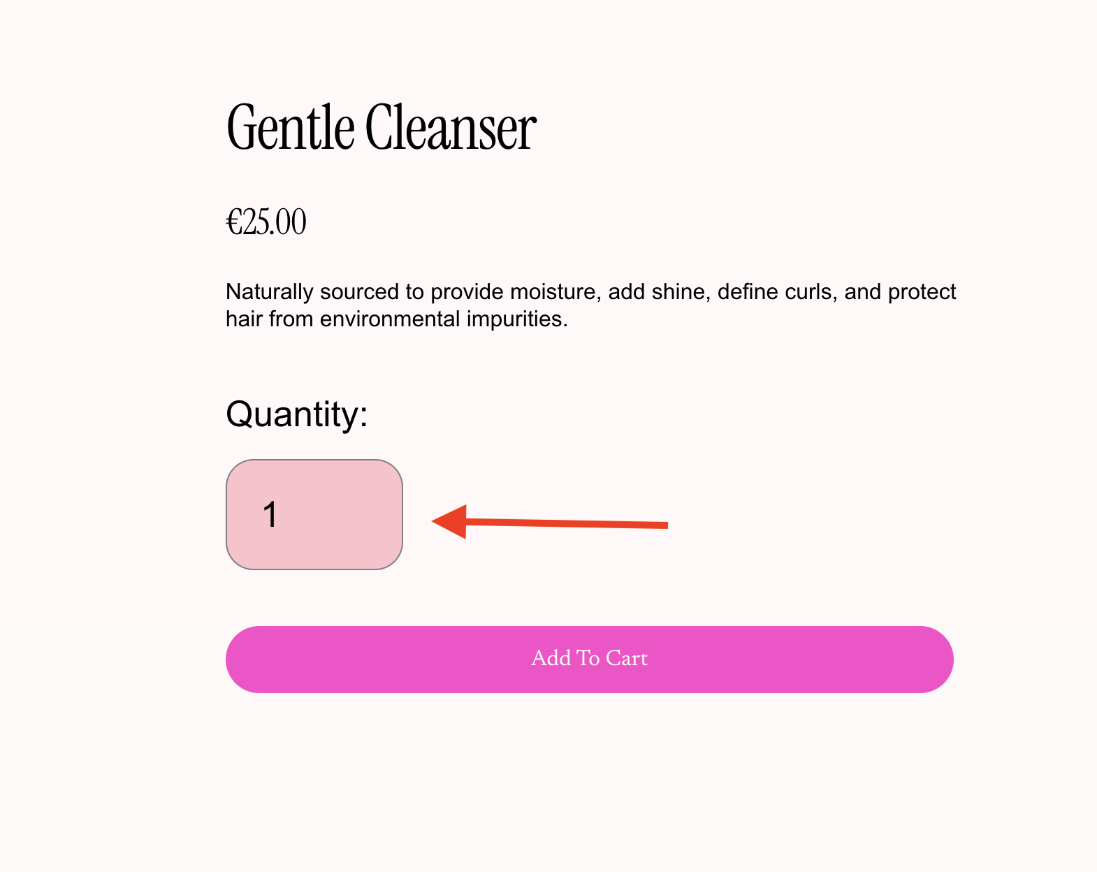
}7. Smaller margins on heading 3 and heading 4

The default margins of heading 3 and heading 4 in Squarespace can be huge. Not any more!
More options: Get complete control over your font sizes with this plugin.
Tags: Typography
Customize: Change ‘1rem’ to make the margins smaller or bigger. Maybe you want to make them even bigger than the default?
CSS snippet:
h3, h4 {
  margin: 1rem 0;
}
8. Scroll indicator

Only one out of five website visitors scroll down to the bottom of a webpage. If you have any crucial information or call-to-actions below the fold, prospective customers might miss out. Not with this scroll indicator!
More options: Check out this plugin for endless scroll indicator options.
Tags: Popular
Customize: Replace SECTION-ID with the section unique id. Adjust ‘2s’ to make the animation faster or slower.
CSS snippet:
SECTION-ID::before {
  content: '';
  animation: bounce 2s ease infinite;
  bottom: 2rem;
  border: solid;
  border-width: 0 3px 3px 0;
  padding: 12px;
  display: inline-block;
  left: 50%;
  transform: rotate(45deg) translateX(-72.5%) translateY(0%);
  position: absolute;
  z-index: 1;
}
@keyframes bounce {
50% {
  transform: rotate(45deg) translateX(-50%) translateY(30%);
}
}
9. Highlight your headings

Want to highlight text and make your unique selling point stand out on Squarespace? This custom CSS will make your headings so vivid that your web visitors will love them.
More options: Looking for more text styling options? Try this plugin.
Tags: Typography
Customize: Mark the heading sections with bold that you want the effect to be added to. Then change the rgba values to the color of your choice.
CSS snippet:
:is(h4, h3, h2, h1, .list-section-title) strong {
  font-weight: inherit !important;
  box-shadow: inset 0 -0.45em 0 0 rgba(255, 87, 106, 0.3) !important;
}
10. Zoom in images on hover
This Squarespace custom CSS code snippet adds a zoom in effect to image blocks when hovered.
More options: Check out this plugin for endless image hover effects.
Tags: Image, Animation
Customize: Change ‘1.6s’ to the speed of your choice.
CSS snippet:
.sqs-block-image img {
  transition: ease-in-out 1.6s !important;
}
.sqs-block-image:hover img {
  transform: scale(1.15) !important;
}
11. Change opacity of any block
Adjust the opacity of any block on your Squarespace website. Great for making unique designs and toning down less important parts of your site.
More options: Looking for more opacity control options? Try this plugin.
Tags: Layouts, Misc
Customize: Replace BLOCK-ID with the block unique id. Adjust ‘0.2’ to the opacity that you prefer.
CSS snippet:
BLOCK-ID .sqs-block-content {
  opacity: 0.2 !important;
}
12. Smaller headings in blog posts

Do your headings end up taking up taking too much space in your blog posts? Use this CSS snippet to make it smaller.
Tags: Typography, Layouts
Customize: Change the numbers to make the margins smaller or bigger.
CSS snippet:
@media screen and (min-width: 800px) {
.blog-item-wrapper h1 {
  font-size: 3.4rem !important;
}
.blog-item-wrapper h2 {
  font-size: 2.4rem !important;
}
.blog-item-wrapper h3 {
  font-size: 1.5rem !important;
}
.blog-item-wrapper h4 {
  margin-bottom: 0.5rem !important;
}
}
13. Vertical text

Easily create vertical text on your site. Copy the code below, and Italicize the text you want vertical.
More options: Get complete control over the text rotation. Try this plugin.
Tags: Typography, Popular
Customize: To make the text tilt instead, change from ‘180deg’ to ‘20deg’.
CSS snippet:
@media only screen and (min-width: 800px) {
em {
  transform: rotate(180deg);
  width: auto !important;
  writing-mode: vertical-rl;
  text-orientation: sideways-right;
}
}
em {
  font-style: normal !important;
}
14. Soft corners on all images

Make all your images get soft corners.
Tags: Image, Layouts
Customize: Change ‘8px’ to make the corners more or less soft.
CSS snippet:
.image-block-outer-wrapper :is(img, .image-overlay) {
  border-radius: 8px !important;
}
15. Animated gradient announcement bar

Make your announcement bar draw more attention with this little CSS code snippet.
More options: Get complete control over the animated gradients. Try this plugin.
Tags: Misc, Animation
Customize: Change the colors (#0d7d88,#708090,#add8e6) to your match your site.
CSS snippet:
[data-header-theme] .sqs-announcement-bar-dropzone .sqs-announcement-bar {
  background: linear-gradient(99deg,#0d7d88,#708090,#add8e6);
  background-size: 400% 400%;
  animation: AnimationName 6s ease infinite;
}
@keyframes AnimationName {
  0% {
    background-position: 0% 49%
  }
  50% {
    background-position: 100% 52%
  }
  100% {
     background-position: 0% 49%
  }
}
16. Simple Blog Post Style

Give your blog posts in the Basic Grid Blog layout a modern look.
More options: Looking for more simple blog post style options? Try this plugin.
Tags: Layouts
Customize: Change the #ffffff to the color of your choice.
CSS snippet:
.blog-basic-grid--container {
  background-color: #ffffff !important;
  color: #000000 !important;
}
.blog-basic-grid--text {
  padding: 40px;
  width: calc(100% - 20px) !important;
}
.blog-article-spacer {
  height: 0px !important;
}
17. Custom CSS Video Play Button
This Squarespace CSS code updates the play button icon to your own icon.
More options: Get complete control over your video play button. Try this plugin.
Tags: Button
Customize: Replace IMAGE-URL-HERE with the link of the icon you'd like to use.
CSS snippet:
.sqs-video-wrapper .sqs-video-overlay .sqs-video-icon {
  position: absolute;
  top: 50%;
  left: 50%;
  background: transparent url(IMAGE-URL-HERE) center center no-repeat;
  background-size: cover !important;
  filter: invert(100%);
  height: 60px;
  width: 60px;
  cursor: pointer;
}
18. Banner Slideshow - Card Style

Add a border and background style to the banner slideshow (auto layout) card style.
More options: Get complete control over your banner slideshow. Try this plugin.
Tags: Layouts
Customize: Adjust the border radius, and background values to your liking.
CSS snippet:
.user-items-list-banner-slideshow .slide-content {
  padding: 40px;
  background: #ffffff !important;
  border-radius: 20px;
}
19. Rotate Blocks

Rotate any block on your Squarespace site.
More options: Looking for more rotating options. Try this plugin.
Tags: Misc, Animation
Customize: Replace BLOCK-ID with the block unique id. Adjust ‘20deg’ to the rotation that you prefer.
CSS snippet:
BLOCK-ID {
  transform: rotate(20deg);
}
20. Spin animation
Animate any block on your Squarespace site!
More options: Looking for more animation options? Try this plugin.
Tags: Misc, Animation
Customize: Replace BLOCK-ID with the block unique id. Adjust ‘15s’ to the time that you prefer.
CSS snippet:
BLOCK-ID .sqs-block-content {
  animation: spin-forever 15s linear infinite;
}
@keyframes spin-forever {
  0% {transform: rotate(0deg);}
  100% {transform: rotate(360deg);}
}
21. Top and Bottom Site Header Border

Add a simple border to the top and bottom of the site header.
More options: Looking for more header customisation options? this plugin.
Tags: Navigation
Customize: Adjust both border px and color values to your liking.
CSS snippet:
.header-announcement-bar-wrapper {
  border-top: 1px solid #ffffff;
  border-bottom: 1px solid #ffffff;
  margin: 20px;
  width: auto !important;
}
22. Mobile Font Size

Easily adjust the heading and paragraph text sizes on mobile.
Tags: Typography, Mobile
Customize: Adjust the font size px values for the heading and paragraph text.
CSS snippet:
@media only screen and (max-width: 800px) {
   h1 { font-size: 40px !important; }
   h2 { font-size: 30px !important; }
   h3 { font-size: 25px !important; }
   h4 { font-size: 20px !important; }
   .sqsrte-large { font-size: 18px !important; }
   p { font-size: 15px !important; }
   .sqsrte-small { font-size: 12px !important; }
   pre { font-size: 12px !important; }
}
23. GIF Mobile Menu Background

This CSS code snippet makes it possible to add your own GIF background image to the mobile menu.
More options: Get complete control over your mobile menu. Try this plugin.
Tags: Mobile, Misc
Customize: Replace GIF-URL-HERE with the url of your own image.
CSS snippet:
.header-menu-bg {
    background: url(GIF-URL-HERE);
    background-size: cover;
    background-position: center;
}
24. Line Cookie Banner
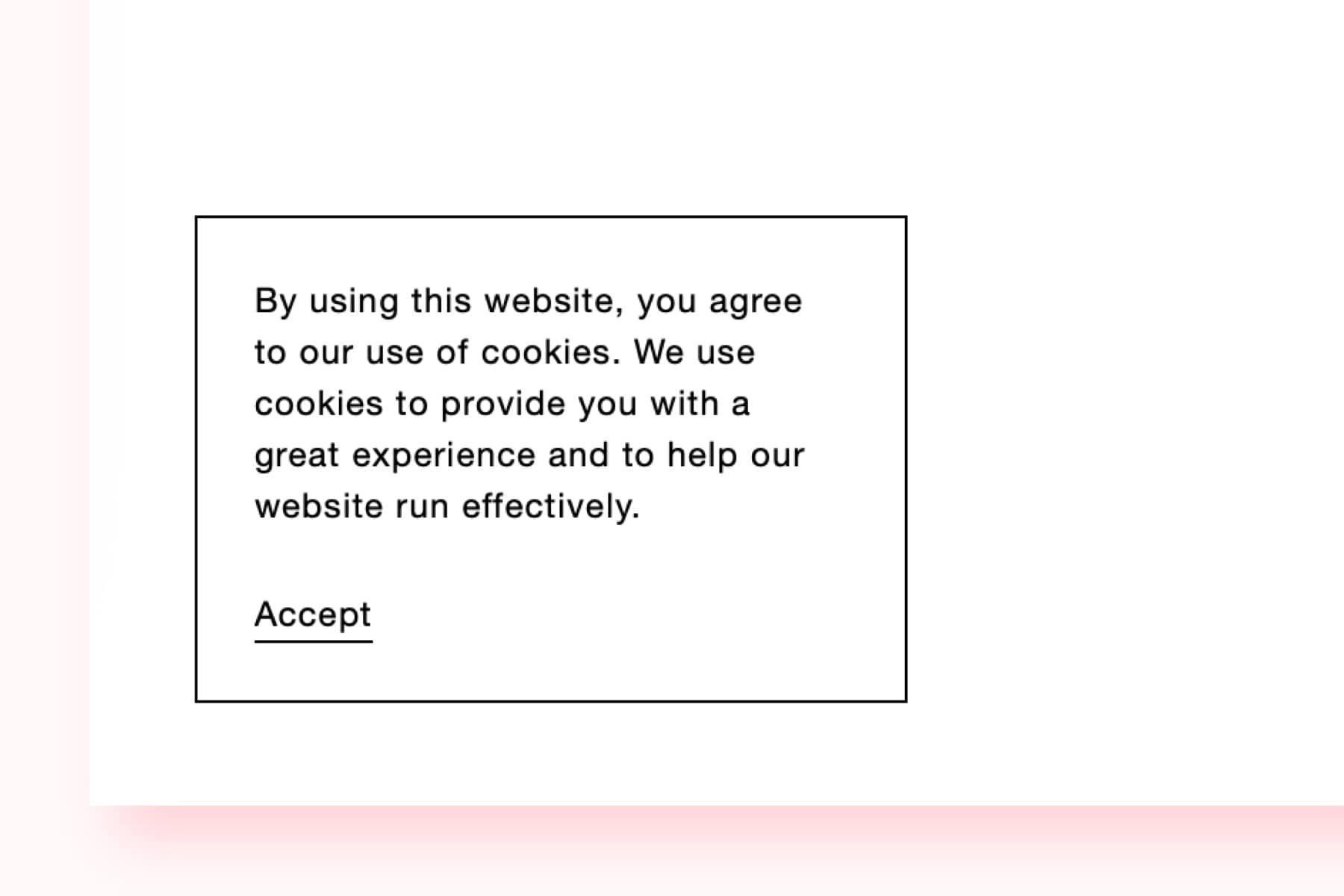
The regular Squarespace cookie banner is ugly. Replace it with one that matches the rest of your design.
More options: Get complete control over your cookie banner. Try this plugin.
Tags: Layouts, Misc
Customize: Change ‘1px’ to increase the width of the border. Or change ‘#000’ to a different color.
CSS snippet:
.sqs-cookie-banner-v2.BAR {
  border-top: 1px solid;
}
.sqs-cookie-banner-v2.POPUP {
  border: 1px solid;
}
.sqs-cookie-banner-v2 {
  border-color: #000 !important;
  background-color: #fff !important;
}
.sqs-cookie-banner-v2 p, .sqs-cookie-banner-v2.LIGHT button, .sqs-cookie-banner-v2.LIGHT a {
  color: #000 !important;
}
.sqs-cookie-banner-v2 button {
  border-color: #000 !important;
}
25. Grow Buttons On Hovered
This CSS snippet for Squarespace buttons adds a growing effect, making buttons scale to 110% of their original size when hovered over.
More options: Customize every detail of your buttons with this plugin.
Tags: Button, Animation
Customize: Change ‘0.3s’ to change the speed.
CSS snippet:
.sqs-block-button-element {
  transition: transform 0.3s ease;
}
.sqs-block-button-element:hover {
  transform: scale(1.1);
}
26. 2 Fonts, 1 Line
Having two different fonts in the same line couldn’t be easier. On any page, highlight the text you’d like to change and select the bold style. Save the page when done.
More options: Get complete control over your fonts. Try this plugin.
Tags: Typography
Customize: Switch out the font family with the name of the font you’d like to use for the second font. Make sure that it is a web safe font, or that you’re using it on another place on your site. Want to use non-web safe fonts? Check out this guide on how to upload custom fonts to Squarespace.
CSS snippet:
:is(h1, h2, h3, h4) strong {
  font-family: Times New Roman !important;
}
27. Floating Image Animation
Another simple effect in this Squarespace CSS cheat sheet. This one adds a gentle floating effect to images, making them appear to float up and down slightly.
More options: Looking for more animation options? Try this plugin.
Tags: Image, Animation
Customize: Edit ‘2s’ to change the speed.
CSS snippet:
.sqs-block-image img {
  animation: float 2s ease-in-out infinite;
}
@keyframes float {
  0%, 100% { transform: translateY(0); }
  50% { transform: translateY(-10px); }
}
28. Invert the Logo Color

You’ve got a beautiful, perfectly sized logo that’s ready to go. The only issue is that it mysteriously disappears when you put your black logo on a black background. This Squarespace css code will fix that!
More options: Get complete control over your logo. Try this plugin.
Tags: Navigation
Customize: Replace PAGE-ID with the page id that you want the logo to be inverted on.
CSS snippet:
PAGE-ID .header-title-logo img {
  filter: invert(100%);
}
29. Improved Cart
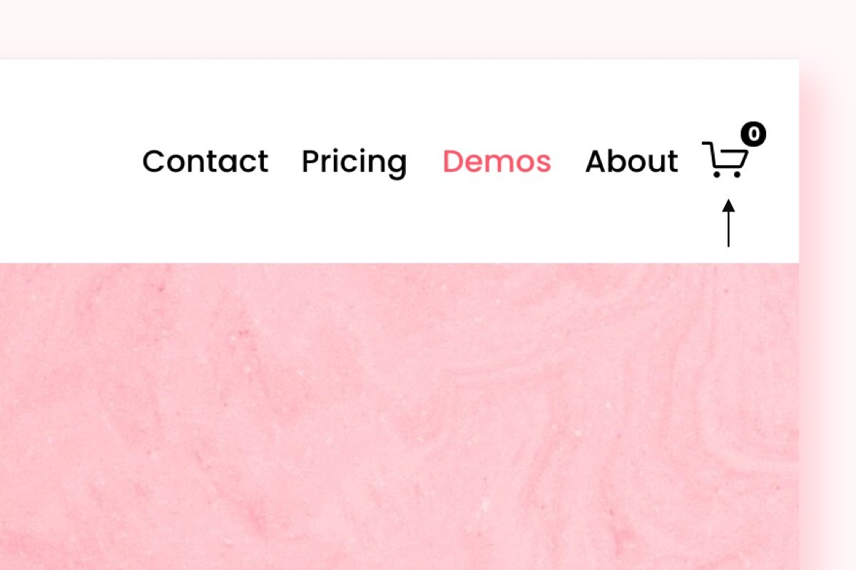
This shopping cart makes it easier to see how many items that’s in the cart.
More options: Customize every detail of your cart with this plugin.
Tags: Navigation, Commerce
Customize: Change the #FFFFFF and #000000 to the colors of your choice.
CSS snippet:
.icon--cart {
  stroke-width: 2px !important;
}
.icon-cart-quantity {
  border-radius: 99px !important;
  top: -0.8em !important;
  right: -0.8em !important;
  min-width: 0.7em !important;
  height: 0.7em !important;
  padding: 0.3em !important;
  line-height: 0.7em !important;
  font-weight: bold !important;
  text-align: center !important;
  font-size: 12px !important;
  transition: 200ms !important;
  background-color: #000000 !important;
  color: #FFFFFF !important;
}
.icon-cart-quantity:not(.legacy-cart) {
  right: 0.2em !important;
}
30. Shadow behind images

This image CSS snippet adds a subtle shadow to image blocks within Squarespace, creating a sense of depth and visual interest. When users hover over the image, the shadow becomes darker.
More options: Looking for more shadow options? Try this plugin.
Tags: Image
Customize: Change the rgba values to the colors of your choice.
CSS snippet:
.sqs-block-image {
  box-shadow: 0px 4px 8px rgba(0, 0, 0, 0.13);
  transition: 0.3s;
}

.sqs-block-image:hover {
  box-shadow: 0px 8px 16px rgba(0, 0, 0, 0.2);
}
31. Section borders
This Squarespace CSS code will highlight your sections by adding a border around it.
More options: Looking for more border options? Try this plugin.
Tags: Layouts
Customize: Change the #000000 to the color of your choice.
CSS snippet:
.page-section .section-background {
  border: 2px solid #000000 !important;
  border-bottom-width: 0 !important;
}
32. Hide Blocks on Desktop and Mobile

This CSS snippet hides a block on either desktop or mobile, giving you control over its visibility across devices.
More options: Get complete control over the blocks with this plugin.
Tags: Popular, Layouts
Customize: Replace BLOCK-ID with the block unique id
CSS snippet:
/* Hide on Mobile (screens 768px and smaller) */
@media only screen and (max-width: 768px) {
    #BLOCK-ID {
        display: none !important;
    }
}

/* Hide on Desktop (screens 1024px and larger) */
@media only screen and (min-width: 1024px) {
    #BLOCK-ID {
        display: none !important;
    }
}
33. Hover Animation
Animate any block on your Squarespace site.
More options: Looking for more animation options? Try this plugin.
Tags: Animation
Customize: Replace BLOCK-ID with the block unique id. Adjust ‘15s’ to the time that you prefer.
CSS snippet:
#block-id {
  animation: bounce 3.5s ease-in-out infinite;
}

@keyframes bounce {
  0%, 100% {
    transform: translateY(0);
    /* Starting and ending position */
  }

  50% {
    transform: translateY(-20px);
    /* Peak of bounce movement */
  }
}
34. Navigation Hover Color
This CSS snippet changes the text color of navigation items when they are hovered over.
More options: Customize every detail of your navigation with this plugin.
Tags: Navigation, Animation
Customize: Change the #000 to the colors of your choice.
CSS snippet:
.header-nav-item a:hover {
    color: #000 !important;
}
35. Drop-down Menu Gap

Easily adjust the gap of the navigation items in the drop-down menu.
More options: Get complete control over your drop-down menu with this plugin.
Tags: Navigation
Customize: Adjust the px values to control the gap.
CSS snippet:
/* Drop-down Menu Gap */
.header-nav-folder-item a {
   padding-top: 10px !important;
   padding-bottom: 10px !important;
}
36. Three-Column Gallery Grid on Mobile

This Squarespace CSS code modifies the gallery grid layout for screens 767px wide or smaller, ensuring it displays three columns on mobile devices.
More options: Looking for more gallery options? Try this plugin.
Tags: Mobile, Layouts
CSS snippet:
/* three-column gallery grid on mobile */
@media only screen and (max-width: 767px) {
  .gallery-grid-wrapper {
    grid-template-columns: 1fr 1fr 1fr !important;
    }
}
37. Hide Background Art Pause/Play Button

This CSS hides the background art pause/play button across the website.
More options: Looking for more hiding options? Try this plugin.
Tags: Misc
CSS snippet:
/* Hide Background Art Pause/Play Button */
.background-pause-button {
    display: none !important;
}
38. File Upload Font Size

Change the file upload font size.
More options: Get complete control over your font size with this plugin.
Tags: Typography
Customize: Adjust the px values to change the font size.
CSS snippet:
/* Adjust the font size for file upload text */
.utsR_PbuBlohcFioliRe {
    font-size: 16px !important;
}
39. Quote Source Left Alignment

Easily left align the quote source of the quote block.
More options: Looking for more font customization options? Try this plugin.
Tags: Misc
CSS snippet:
/*  Quote Source Left Alignment */
.sqs-block-quote .source {
    text-align: left; /* Aligns to the left */
}
40. Gallery Lightbox Close Icon Size

With this CSS you can change the size of the gallery lightbox close icon in Squarespace.
Tags: Image, Misc
Customize: Adjust the scale value to change its size.
CSS snippet:
/* Gallery Lightbox Close Icon Size */
.yui3-lightbox2 .sqs-lightbox-close {
    scale: 2 !important;
    translate: 10px 10px !important;
}
41. Hide Announcement Bar Close Icon

Easily hide the announcement bar close icon.
More options: Get complete control over your announcement bar with this plugin.
Tags: Misc
CSS snippet:
/* Hide Announcement Bar Close Icon */
.sqs-announcement-bar-close {
     display: none;
}
42. Display Product Breadcrumbs On Mobile

This CSS displays the product breadcrumbs on mobile.
More options: Looking for more display options? Try this plugin.
Tags: Mobile, Commerce
CSS snippet:
/* Display Product Breadcrumbs On Mobile */
div.ProductItem-nav-breadcrumb {
    display: flex !important;
}
43. Instagram Feed Border Radius

Easily add border radius to all of your Instagram feed images.
More options: Check out this plugin for endless image options.
Tags: , Image, Layouts
Customize: Change "10px" to adjust the roundness.
CSS snippet:
/* Instagram Feed Border Radius */
div.instagram-block .slide a {
  border-radius: 10px !important;
}
44. Floating Header + Border Radius

This Squarespace CSS code gives the header a new look (floating) and adds border radius.
More options: Get complete control over your header with this plugin.
Tags: Navigation
Customize: Adjust the px values to change the header margin. Change "10px" to adjust the roundness.
CSS snippet:
/* Floating Header + Border Radius */
.header {
  margin: 20px;
  border-radius: 10px;
  overflow: hidden;
}
45. Footer Shadow

This CSS adds top shadow to the footer.
Tags: Misc
Customize: Adjust the px values to change the shadow direction and intensity. Change “#030303” to change the shadow color.
CSS snippet:
/* Footer Shadow */
#footer-sections {
    z-index: 99999 !important;
    box-shadow: 0px 17px 30px 0px #030303;
}
46. Hide Blog Post Titles

This CSS code hides the blog post titles on your Squarespace website.
More options: Looking for more hiding options? Try this plugin.
Tags: Typography, Misc
CSS snippet:
/* Hide Blog Post Titles */
h1.blog-title, .blog-item-title {
    display: none !important;
}
47. Drop-down Menu Auto Width

This CSS adds auto width to the drop-down menu making sure it expands based on the length of the menu item.
More options: Get complete control over your drop-down menu with this plugin.
Tags: Navigation
CSS snippet:
/* Drop-down Menu Auto Width */
.header-nav-folder-content {
    width: auto !important;
    min-width: unset !important;
}
48. Shop Category Hover Effect

We’re getting close to half of this Squarespace CSS cheat sheet! With this you can add a hover effect to the shop category.
More options: Get complete control over your text animation with this plugin.
Tags: Commerce, Animation
Customize: Change “red” to your desired color.
CSS snippet:
/* Shop Category Hover Effect */
.products.collection-content-wrapper
.nested-category-tree-wrapper li:hover {
  color: red;
}
.products.collection-content-wrapper
.nested-category-children :hover {
  color: red;
}
49. Contact Form - "Thank you!" Message Font Color

This code changes the contact form "Thank you!" message font color.
More options: Get complete control over your text animation with this plugin.
Tags: Typography, Misc
Customize: Change “red” to your desired color.
CSS snippet:
/* Contact Form - "Thank you!" Message Font Color */
div.form-submission-text {
  color: red !important;
}
50. Blurry Drop-down Menu

This CSS adds a blurry effect to the drop-down menu.
More options: Get complete control over your drop-down menu with this plugin.
Tags: Navigation
Customize: Adjust the px values to control the blur.
CSS snippet:
/* Blurry Drop-down Menu */
.header-nav-folder-content {
  background: transparent !important;
  -webkit-backdrop-filter: blur(4px);
  backdrop-filter: blur(4px);
}
51. Portfolio Pagination Arrows: Size + Color

This CSS snippet increases the size and changes the color of the portfolio pagination arrows.
Tags: Navigation, Misc
Customize: Adjust the scale values to control the size and change “red” to any color you wish.
CSS snippet:
/* Portfolio Pagination Arrows: Size + Color */
.item-pagination-link .item-pagination-icon svg {
  font-size: 2em !important;
  transform: scale(2.5) !important;
  stroke: red !important;
}
52. Drop-down Menu Arrow
This CSS adds an arrow to indicate an navigation item has a drop-down menu activated.
More options: Get complete control over your drop-down menu with this plugin.
Tags: Navigation
Customize: Adjust the px values to customize the arrow even further.
CSS snippet:
/* Drop-down Menu Arrow */
a.header-nav-folder-title:after {
    content: "\e009";
    font-family: 'squarespace-ui-font';
    position: relative;
    top: 1px;
    font-size: 1.1em; /* Ensures a thin appearance */
    margin-left: 4px;
    transform: scale(0.8); /* Shrinks the arrow */
    display: inline-block;
}
/* Rotate arrow on hover */
a.header-nav-folder-title:hover:after {
    transform: rotate(180deg) scale(0.8);
}
53. Product Sold-out Font Color + Strike-through

Change the sold out text color and adds a strike-through.
More options: Looking for more sold-out customization options? Try this plugin.
Tags: Commerce, Typography
Customize: Change “red” to any color you like.
CSS snippet:
/* Product Sold-out Font Color + Strike-through */
.product-mark.sold-out {
    color: red !important;
    text-decoration: line-through;
}
54. Two-Column Drop-down Menu

This CSS adds a second column to the drop-down menu.
More options: Get complete control over your drop-down menu with this plugin.
Tags: Navigation
CSS snippet:
/* 2-Column Drop-down Menu */
div.header-nav-folder-content {
    column-count: 2;
}
55. Blog Thumbnails Solid Shadow

This CSS code adds a solid shadow to all blog thumbnails.
More options: Check out this plugin for endless solid shadow options.
Tags: Layouts, Misc
Customize: Change the px values and “black” to customize the shadow even further.
CSS snippet:
/* Blog Thumbnails Solid Shadow */
.blog-item .image-wrapper {
  color: black !important;
  border: 1px solid black !important;
  box-shadow: 8px 8px black !important;
}
56. Promotional Popup Border Radius

Easily add border radius to the promotional popup.
Tags: Layouts, Misc
Customize: Change "20px" to adjust the roundness.
CSS snippet:
/* Promotional Popup Border Radius */
.sqs-slide-layer-content {
  border-radius: 20px !important;
}
57. Align Social Media Icons on Mobile
This Squarespace CSS code snippet aligns the social media icons block on mobile only.
More options: Get complete control over your social media icons with this plugin.
Tags: Mobile
Customize: Change “center” to “left” or “right” to change the alignment.
CSS snippet:
/* Align Social Media Icons on Mobile */
@media only screen and (max-width: 767px) {
  .social-icon-alignment-left .sqs-svg-icon--list {
    justify-content: center;
  }
}
58. Shop Page - Inline Product Price

This CSS snippet makes the product price on the shop page to be inline with the product title.
Tags: Commerce, Typography
CSS snippet:
/* Shop Page - Inline Product Price  */
.grid-main-meta {
  display: inline-flex;
  justify-content: space-between;
  width: 100%;
}
.grid-prices {
  margin-top: 0px !important;
}
59. Summary Block - Sold Out Tag Color

This CSS let’s you customize the color of the sold out tag for the summary block.
More options: Looking for more sold-out customization options? Try this plugin.
Tags: Commerce, Typography
Customize: Change “red” to “white” or to the color of your choice.
CSS snippet:
/* Summary Block - Sold Out Tag Color */
.sqs-block-summary-v2 .summary-product-status .product-mark {
    background: red !important;
    color: white !important;
}
60. Gallery Grid Simple - Caption Font Size

Easily control the caption font size of the gallery grid simple.
More options: Get complete control over your font sizes with this plugin.
Tags: Image, Typography
Customize: Change the px values to control the font size.
CSS snippet:
/* Gallery Grid Simple - Caption Font Size */
p.gallery-caption-content {
    font-size: 30px !important;
}
61. Gallery Grid Simple - Grayscale on Hover
Easily add a hover effect to the gallery grid simple.
More options: Check out this plugin for endless gallery animation options.
Tags: Image, Animation
Customize: Change “500ms” to control the hover transition speed.
CSS snippet:
/* Gallery Grid Simple - Grayscale on Hover */
.gallery-grid-item-wrapper:hover img {
   filter: grayscale(0);
    transition:ease-in-out 500ms;
  &:hover {
    filter: grayscale(1);
  }
}
62. Rounded Floating Cart

This CSS code snippet makes the floating cart completely rounded.
More options: Customize every detail of your cart icon with this plugin.
Tags: Commerce
Customize: Change "70px" to adjust the roundness.
CSS snippet:
/* Rounded Floating Cart */
.floating-cart {
	border-radius: 70px !important;
}
63. Drop-down Menu Border Radius

Easily add border radius to the drop-down menu.
More options: Get complete control over your drop-down menu with this plugin.
Tags: Navigation
Customize: Change "10px" to adjust the roundness.
CSS snippet:
/* Drop-down Menu Border Radius */
.header-nav-folder-content {
  border-radius: 10px!important;
}
64. Carousel List Items - Border Radius

This CSS code adds border radius to the list section items.
More options: Looking for more carousel list options? Try this plugin.
Tags: Layouts
Customize: Change "20px" to adjust the roundness.
CSS snippet:
/* Carousel List Items -  Border Radius */
.list-item {
  border-radius: 20px !important;
  overflow: hidden;
}
65. Footer - Remove Underline from Links

This Squarespace CSS code removes the underline from any link in the footer section.
More options: Get complete control over your links with this plugin.
Tags: Misc
CSS snippet:
/* Footer - Remove Underline from Links */
footer .sqs-block-html a {
  background-image: none !important;
  background-repeat: no-repeat !important;
  text-decoration: none !important;
}
66. Accordion Button

This CSS adds a button inside the accordion block in Squarespace.
More options: Customize every detail of your accordion with this plugin.
Tags: Layouts, Button
Customize: Change the px values and colors to customize the button even further. Note: Add a link in the accordion description box to active the button.
CSS snippet:
/* Accordion Button */
.sqs-block-accordion .accordion-item__description a {
  background: linear-gradient(45deg, #FF66CC, #FF99CC) !important;
  color: white !important;
  padding: 12px 25px !important;
  border-radius: 25px !important;
  display: inline-block;
  margin-top: 5px !important;
  transition: background 0.3s ease, transform 0.3s ease;
}
.sqs-block-accordion .accordion-item__description a:hover {
  background: linear-gradient(45deg, #FF55BB, #FF88BB) !important;
  transform: translateY(-2px);
}
67. Video Block - Solid Shadow

This CSS adds a solid shadow to video blocks.
More options: Check out this plugin for endless solid shadow options.
Tags: Layouts, Popular
Customize: Change the px values and “black” to customize the shadow even further.
CSS snippet:
/* Video Block - Solid Shadow */
.video-block {
color: black !important;
  border: 0px solid black !important;
  box-shadow: 10px 10px black !important;
}
68. Frosted Mobile Menu Background

This CSS adds a frosted effect to the mobile menu background.
More options: Get complete control over your mobile menu with this plugin.
Tags: Mobile
Customize: Change the px values and to customize the effect.
CSS snippet:
/* Frosted Mobile Menu Background */
.site-wrapper .header-menu .header-menu-bg {
  background-color: rgba(0,0,0,0.2)!important;
}
.header--menu-open {
  #page {
  filter: blur(5px) !important;
  }
}
69. Gradient Header Button

This CSS snippet gives the header button a nice gradient color.
More options: Customize every detail of your buttons with this plugin.
Tags: Navigation, Button
Customize: Change “#ff9a9e ” to the color of your choice.
CSS snippet:
/* Gradient Header Button */
.header-actions .btn, .header-menu .header-menu-cta a {
  background: linear-gradient(-45deg, #ff9a9e, #fad0c4, #fcb69f, #a18cd1, #fbc2eb, #8fd3f4, #ff9a9e);
}
70. Carousel Image Hover Effect

This CSS snippet adds a nice hover effect to the carousel images.
More options: Get complete control over your carousel with this plugin.
Tags: Image, Animation
Customize: Change “0.5s ” to control the transition speed.
CSS snippet:
/* Carousel Image Hover Effect */
.user-items-list-carousel__media-inner::after {
  background: rgba(0, 0, 0, 0.5) !important;
  content: '';
  display: block;
  width: 100%;
  height: 100%;
  position: absolute;
  top: 0;
  left: 0;
  opacity: 1;
  transition: opacity 0.5s ease, box-shadow 0.5s ease;
  pointer-events: auto;
}
.user-items-list-carousel__media-inner:hover::after,
.user-items-list-carousel__media-inner:focus::after {
  opacity: 0;
  box-shadow: 0px 0px 30px rgba(0, 255, 255, 0.7);
}
71. Calendar Block - Hide Event Time

Easily hide the event time in the calendar block.
Tags: Layouts, Misc
CSS snippet:
/* Calendar Block - Hide Event Time */
.item-time,.flyoutitem-datetime {
    display: none !important;
}
72. Product Page - Sold-out Strike-through

This CSS snippet adds a strike-through to the product title, price, sold out & button text.
More options: Looking for more sold-out customization options? Try this plugin.
Tags: Commerce, Typography
CSS snippet:
/* Product Page - Sold-out Strike-through */
.sold-out * {
    text-decoration: line-through !important;
}
73. Footer - Social Icons Hover Color
Add a nice hover color to the footer social icons with this awesome CSS snippet.
More options: Get complete control over your social media icons with this plugin.
Tags: Animation
Customize: Replace "pink" with the desired color if needed.
CSS snippet:
/* Footer: Social Icons Hover Color */
footer.sections a:hover use.sqs-use--icon {
    fill: pink !important;
}
74. Header Hover Color
This CSS snippet changes the header color on hover.
More options: Looking for more header customization options? Try this plugin.
Tags: Navigation, Animation
Customize: Change “pink ” to the color of your choice.
CSS snippet:
/* Header Hover Color */
header#header,
header#header .header-background-solid {
  transition: background-color 0.3s ease, opacity 0.3s ease;
}
header#header:hover,
header#header:hover .header-background-solid {
  background-color: pink !important;
  opacity: 1 !important;
}
75. Accordion - Title + Icon Hover Color
This CSS code adds a hover color to the accordion title & icon.
More options: Customize every detail of your accordion with this plugin.
Tags: Misc, Animation
Customize: Replace "pink" with the desired color if needed.
CSS snippet:
/* Accordion - Title + Icon Hover Color */
.accordion-item:hover {
  .accordion-item__title, .accordion-icon-container {
    color:pink !important;
  }
}
.accordion-item[data-is-open="true"] {
    .accordion-item__title, .accordion-icon-container {
    color:!important;
  }
}
76. Blog Thumbnails Border Radius

This CSS applies a 20px border radius to the blog thumbnail images, giving them rounded corners.
Tags: Layouts
Customize: Change "20px" to adjust the roundness.
CSS snippet:
/* Blog Thumbnails Border Radius */
.blog-item .image-wrapper {
  border-radius: 20px !important;
}
77. Portfolio Grid Overlay - Uppercase Title

This CSS snippet transforms the portfolio grid overlay title from lowercase to uppercase.
Tags: Typography
CSS snippet:
/* Portfolio Grid Overlay - Uppercase Title */
h3.portfolio-title, span.portfolio-hover-item-content {
    text-transform: uppercase !important;
}
78. Banner Slideshow - Gradient Arrow Background
This Squarespace CSS code adds a gradient background to the banner slideshow arrows.
More options: Looking for more slideshow customization options? Try this plugin.
Tags: Layouts
Customize: Change “#ff6b6b, #f06595, #cc5de8, #845ef7” to the color of your choice.
CSS snippet:
/* Banner Slideshow: Gradient Arrow Background */
button.user-items-list-banner-slideshow__arrow-button>div {
  background: linear-gradient(45deg, #ff6b6b, #f06595, #cc5de8, #845ef7) !important;
  background-size: 100% 100% !important;
}
79. Product Quantity - Background Color + Border Radius
This CSS adds a background color & border radius to the product quantity box.
Tags: Commerce
Customize: Change “pink”to the color of your choice and the px values to adjust the roundness.
CSS snippet:
/* Product Quantity: Background Color + Border Radius */
.product-quantity-input input[type="number"] {
    background-color: pink !important;
    border-radius: 20px !important;
}
80. Accordion - Background + Border Radius + Hover
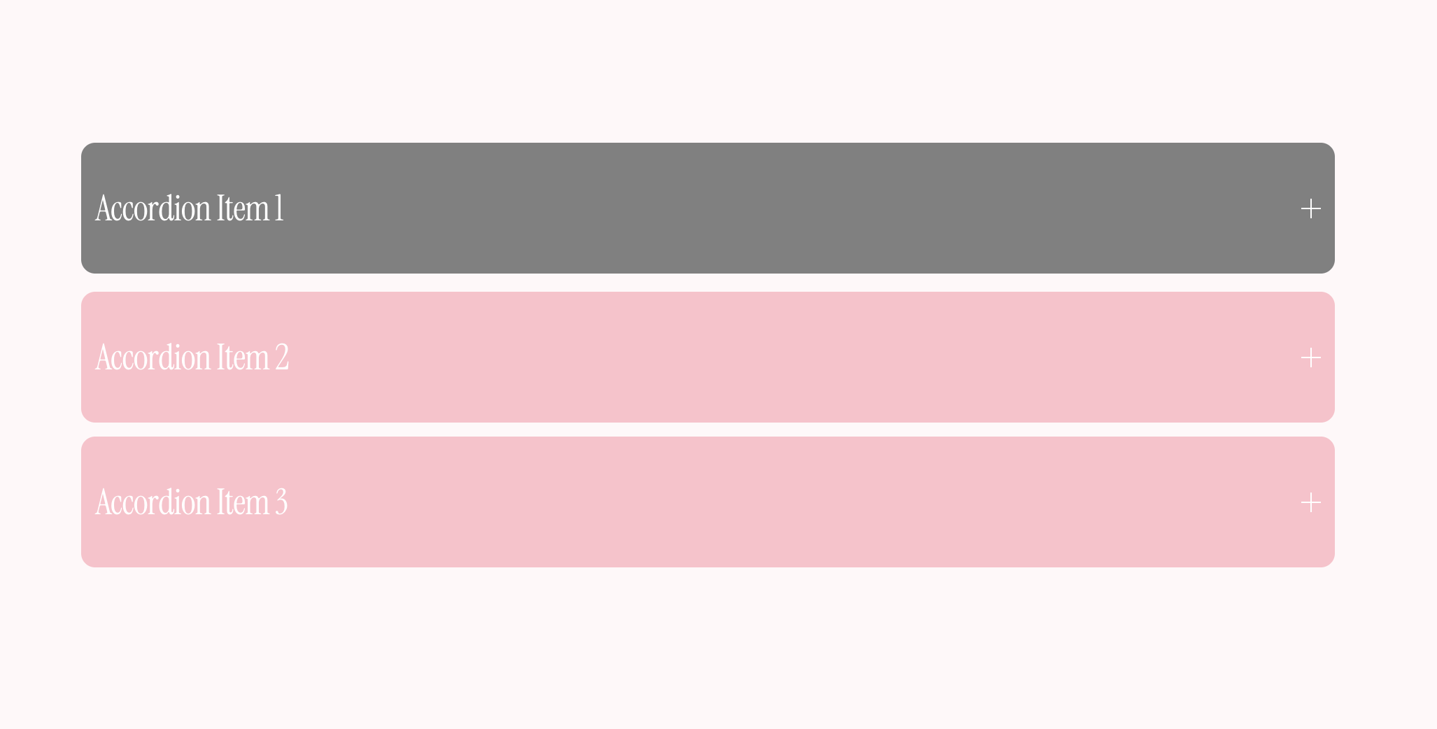
This CSS adds a background color, hover color & border radius to accordion block in Squarespace.
More options: Customize every detail of your accordion with this plugin.
Tags: Popular
Customize: Change “pink” and “grey” to the color of your choice and the px values to control the border radius, padding and margin.
CSS snippet:
/* Accordion: Background + Border Radius + Hover */
div.accordion-divider {
    display: none;
}
li.accordion-item {
    background-color: pink;
    margin-bottom: 12px !important;
    border-radius: 12px;
    padding: 0px 12px !important;
}
li.accordion-item:hover {
    background-color: grey !important;
    transform: translateY(-3px);
}
81. Newsletter - Email Address Field Border Radius

This CSS applies border-radius to the email input field in the newsletter form.
Tags: Popular
Customize: Change "8px" to adjust the roundness of the corners.
CSS snippet:
/* Newsletter - Email Address Field Border Radius */
.newsletter-form-field-element {
  border-radius: 8px !important;
}
82. Hide "View Event" Button

This CSS code hides the "View Event" button in the event list.
More options: Looking for more hiding options? Try this plugin.
Tags: Button
Customize: If you want to hide only specific buttons, consider adding a more specific selector. - Use `display: none !important;` to ensure the button is completely hidden.
CSS snippet:
/ *Hide "View Event" Button */
a.eventlist-button.sqs-editable-button.sqs-button-element--primary {
    display: none !important;
}
82. Carousel - Two-column on Mobile

This CSS modifies the carousel layout for screens 767px wide or smaller, ensuring it displays two columns on mobile devices.
Tags: Layouts, Mobile
Customize: Replace SECTION-ID with the section unique id.
CSS snippet:
/* Carousel - Two-column on Mobile */
@media screen and (max-width: 767px) {
  section[data-section-id="SECTION-ID"] ul {
  display: grid;
  grid-template-columns: repeat(2,1fr) !important;
  }
}
83. Site Title - Subtitle

This CSS adds a subtitle below the main site title in the header.
Tags: Navigation, Misc
Customize: Change "Your Text Here" (in the content property) to your desired subtitle text. Adjust font-size, color, and positioning (top, left, width) as needed.
CSS snippet:
/* Site Title - Subtitle */
header .header-title a:after {
  content: "Your Text Here";
  position: absolute;
  top: 100%;
  left: 0;
  width: 100%;
  font-size: 1rem;
  color: black;
}
84. Blog Page - "Read More" Button

This CSS snippet turns the “read more” text on the blog page into a button, adds a background color, hover effect, and border radius.
Tags: Button
Customize: Change “pink” (base background) and “#ff80ab” (hover background) to your preferred colors. - Adjust padding, margin, and border-radius values to control spacing and rounding.
CSS snippet:
/* Blog Page - "Read More" Button */
.blog-more-link::after {
display:none;
}
.blog-more-link {
 border: 0px solid #000;
 padding: .9rem!important;
 margin-top:.5rem;
 border-radius: 10px;
 background: pink;
 color: white !important;
}
.blog-more-link:hover {
    background: #ff80ab;
    transform: scale(1.05);
}
85. Full-width Mobile Menu CTA
This CSS makes the call-to-action (CTA) button in the mobile menu span almost the full width. With so many CSS codes in this Squarespace cheat sheet, this is one that I regularly use.
More options: Get complete control over your mobile menu with this plugin.
Tags: Mobile, Button
Customize: Adjust "86vw" to control the button width (e.g., 90vw for a wider look).
CSS snippet:
/* Full-width Mobile Menu CTA */
.header-menu-cta a {
    width: 86vw !important;
}
86. Audio Block - Background Color

This CSS sets the background color for dark-themed audio widgets on your Squarespace site.
Tags: Misc
Customize: Change "grey" to your desired background color (e.g., #cccccc, #000, etc.).
CSS snippet:
/* Audio Block Background Color */
.sqs-widgets-audio-player.dark {
    background-color: grey !important;
}
87. Contact Form - Hide "(required)" Text

This CSS hides the "required" text from the conttact form fields.
Tags: Misc
CSS snippet:
/* Contact Form: Hide "required" Text */
span.description.required {
    display: none !important;
}
88. List Section - Zoom on Hover

This CSS code adds a zoom effect to images within list items (with card functionality enabled) when hovered over.
More options: Looking for more customization options? Try this plugin.
Tags: Layouts, Animation
Customize: Change the scale value (currently 1.1) to adjust how much the image zooms. Modify the transition duration (currently 0.7s) to speed up or slow down the effect.
CSS snippet:
/* List Section: Zoom on Hover */
.list-item[data-is-card-enabled="true"] img:hover{
  transform: scale(1.1);
  transition: .7s;
  overflow: hidden;
}
89. Hide Logo on Scroll (desktop only)
This Squarespace CSS code hides the logo in the header when the page is scrolled (i.e. when the "shrink" class is applied). It also removes the top margin from the header navigation.
Tags: Misc
CSS snippet:
/* Hide Logo on Scroll */
.shrink {
.header-display-desktop .header-title img {
 height: 0 !important;
}
.header-display-desktop .header-nav {
margin-top: 0 !important;
}
}
90. Donation Block - Font Style

This CSS let’s you change the donation block font style.
Tags: Misc, Typography
Customize: Change the font-size, font-weight, and font-style values as desired.
CSS snippet:
/* Donation Block: Font Style */
.sqs-donation-block-container .radio-label:first-line {
  font-size:25px !important;
  font-weight:bold !important;
  font-style:normal !important;
}
91. Blog Comments - Background Color

This CSS snippet adds a background color to the blog comments section.
Tags: Misc
Customize: Change “pink” and “black” to the colors of your choice.
CSS snippet:
/* Blog Comments - Background Color */
.squarespace-comments .new-comment-area .input form.comment-form textarea, .squarespace-comments .new-comment-area {
  background: pink !important;
  color: black !important;
}
92. Summary Block - Solid Border

This CSS adds a solid border, rounded corners, and a subtle scale effect to images within a summary block.
Tags: Layouts
Customize: Change the “black” color to your desired border color, adjust the px values to control the border radius, border thickness, and scale factor.
CSS snippet:
/* Summary Block - Solid Border */
.sqs-block-summary-v2 .img-wrapper img {
    border-radius: 10px !important;
    border: 2px solid black !important;
    transform: scale(0.96) !important;
}
93. Burger Menu Styling

This CSS snippet adds a border, background color, rounded corners, and padding to the burger menu icon.
More options: Get complete control over your mobile menu with this plugin.
Tags: Mobile
Customize: Change the “black” and “pink” colors as desired, and adjust the px values for border thickness, border radius, and padding.
CSS snippet:
/* Burger Menu Styling */
.burger {
  border: solid 2px black !important;
  background-color: pink !important;
  border-radius: 5px;
  padding: 7px;
}
94. Right Side Mobile Menu

This CSS moves the mobile menu to the right side and adjusts its width.
More options: Get complete control over your mobile menu with this plugin.
Tags: Mobile
Customize: Change the width percentage as needed to control how much of the screen the menu takes up.
CSS snippet:
/* Right Side Mobile Menu */
div.header-menu {
    left: unset !important;
    width: 71% !important;
}
[data-folder="root"]~div:not(.header-menu-nav-folder--active) {
    opacity: 0;
}
95. Menu Block - Background Color
This CSS changes the background color of the menu block.
Tags: Layouts, Misc
Customize: Replace "pink" with any color of your choice (hex, RGB, or color name).
CSS snippet:
/* Menu Block - Background Color */
.menu-wrapper {
    background: pink !important;
}
96. Scrolling Block - Gradient Background
This CSS code applies a gradient background to the scrolling marquee block.
Tags: Layouts, Popular
Customize: Adjust the degree (e.g., 980deg) to change the direction of the gradient. Replace #FFC0CB and #FF69B4 with any colors you prefer.
CSS snippet:
/* Scrolling Block - Gradient Background */
.sqs-block-marquee {
  background: linear-gradient(980deg, #FFC0CB, #FF69B4) !important;
}
97. Search Bar - Background Color

This CSS customizes the search bar by adding a pink background and rounded corners.
Tags: Misc
Customize: Change "pink" to your desired background color (using hex, RGB, or color name) and adjust 10px for a different border radius.
CSS snippet:
/* Search Bar - Background Color */
.search-input {
 border-radius: 10px !important;
 background-color: pink !important;
}
98. Archive Drop-down - Background Color

Change the background color of the Archive drop-down area on your Squarespace site.
Tags: Misc
Customize: Change "pink" to your desired background color (using hex, RGB, or color name).
CSS snippet:
/* Archive Drop-down - Background Color */
.sqs-block-archive .archive-block-setting-layout-dropdown.archive-block-wrapper{
  background-color: pink!important;
}
99. Calendar Block - Date Font Size

This Squarespace custom CSS targets the day number markers in the Squarespace calendar block, setting their font size to 18px and making them bold (font-weight 700).
Tags: Misc, Typography
Customize: Change the 18px and 700 values as needed.
CSS snippet:
/* Calendar Block - Date Font Size */
.yui3-squarespacecalendar .marker-dayname, .yui3-squarespacecalendar .marker-daynum {
    font-size: 18px !important;
    font-weight: 700 !important;
}
100. Shop Page - Product Border Radius

For the entry number 100 in this free Squarespace CSS cheat sheet you can round the corners of product images on your shop page by applying a border radius.
Tags: Commerce
Customize: Change the 35px value to adjust how rounded the corners are.
CSS snippet:
/* Shop Page - Product Border Radius */
.grid-image-wrapper {
    border-radius: 35px !important;
}
101. Site Title Below Logo
Add a custom text element below the logo link to display the site title. It also vertically aligns the logo image with the text.
Tags: Navigation
Customize: Customize the text, font size, font-family, and colors as needed.
CSS snippet:
/* Site Title Below Logo */
.header-title-logo a:after {
  content: "Site Title";
  display: inline-block;
  font-size: 16px;
  font-family: Poppins;
  color: black;
  text-align: center;
  vertical-align: middle;
  font-weight: 900;
  padding-left: 0px;
}
102. Chart Background Color

This CSS snippet sets the background color of elements with the class "chart-block-container" to pink.
Tags: Misc
Customize: Replace "pink" with any other color (e.g., a hex code or RGB value) if needed.
CSS snippet:
/* Chart Background Color */
.chart-block-container {
  background: pink !important;
}
103. Product Block (stand-alone) - Hide Quantity Box

This CSS hides the quantity input box in the product block.
Tags: Commerce
Customize: Remove or modify this rule if you want the quantity input to be visible.
CSS snippet:
/* Product Block (stand-alone) - Hide Quantity Box */
.product-block .productDetails.center .product-quantity-input {
    display: none !important;
}
More Squarespace customizations
Didn’t find the CSS code you were looking for?
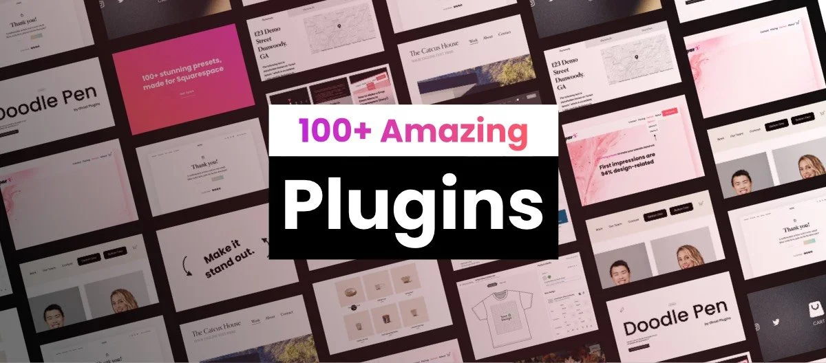
Spark Plugin is a design tool with over 100 customizations for Squarespace. There’s a good chance that what you’re trying to accomplish is possible with Spark Plugin.
Three Alternatives to Squarespace Custom CSS
As we’ll discus later in this article, custom CSS codes are not risk-free.
The best alternative to using custom code is to use a plugin or extension that has an auto-update feature.
This means that the code will be updated whenever a new browser version is released, or Squarespace updates its service.
1. Squarespace plugins
Plugins and extensions are often more sophisticated than little Squarespace code snippets and can be used as more safe alternatives to custom CSS code. Especially if they include an auto-update feature.
Here’s a super long list of Squarespace plugins.
2. Squarespace templates
Squarespace templates offer advanced functionalities beyond simple code snippets, serving as safer and more robust alternatives to custom CSS.
Each template is fully customizable, allowing you to adjust layouts, colors, and fonts to create a unique online presence. With responsive design built in, your site will look great on any device, ensuring a seamless user experience.

3. Spark Plugin
Spark Plugin is a no-code design tool that contains 100+ customizations for Squarespace websites.
With Spark Plugin, you don’t have to worry about your code ever breaking again.
There are some pretty nice customizations to choose from too.
FAQ - Squarespace CSS Code Snippets
How do I add custom CSS in Squarespace?
New to Squarespace or just need a refresher? Here’s how to add custom CSS to your Squarespace site: Open Squarespace Dashboard, go to Website → Website Tools → Custom CSS, paste your snippet, and click Save.
Can I use multiple CSS snippets at the same time?
Yes, but be careful. Multiple snippets can sometimes conflict with each other, especially if they target the same elements. To stay organized, add comments in your CSS or group related styles together.
Does adding CSS slow down my Squarespace site?
In most cases, small CSS tweaks won’t affect speed. However, overly complex CSS or large amounts of code can slow things down. Keeping it minimal and optimized is key.
Can CSS code snippets break my website?
Yes, custom CSS can cause issues if not used carefully. Here are the three most common reasons:
Squarespace updates – Your CSS code stays the same, but Squarespace updates its platform. This can lead to conflicts.
Browser differences – A CSS snippet might look perfect in one browser but not work properly in another.
Mobile compatibility – Desktops and mobile devices have different screen sizes and interactions (like hover vs. touch), which can cause unexpected issues.
What happens if I want to remove a CSS snippet?
Simply go back to the Squarespace custom CSS section, delete the code, and click Save. If you’re not sure which part of the code is causing an issue, try removing snippets one by one.
How can I minimize the risk of custom CSS breaking my site?
Customizing your site with Squarespace CSS codes is still a great way to enhance its design. Here’s how to do it safely:
Keep it short – The longer the CSS snippet, the higher the chance of conflicts.
Test across devices – Always check how the code looks on different browsers and mobile devices.
Use a plugin with auto-updating CSS – Tools like Spark Plugin keep your customizations updated, reducing the risk of future issues.
Will Squarespace support help if my custom CSS breaks something?
No, Squarespace does not provide support for custom CSS. If an issue arises, you’ll need to debug it yourself, remove the code, or use a plugin that handles CSS safely.
So… what do you think of this Squarespace CSS cheat sheet?
In this Squarespace CSS cheat sheet, I’ve gathered a collection of useful CSS code snippets to help customize your Squarespace website and make it truly stand out. Whether you’re tweaking fonts, adjusting layouts, or adding stylish effects, these codes are designed to simplify your design process.
Got a favorite CSS trick that’s not on the list? Or maybe a code snippet you think others would love? Let me know in the comments or send me a message—I’d love to include your suggestions and make this guide even better for the Squarespace community!