10+ Most Useful Squarespace Drop Down Menu Styles
Looking to give your website a splash of sophistication? Dive into the world of Squarespace drop down menu styles!
Going beyond basic, we'll uncover how to customize drop down menu Squarespace options with flair.
From font tweaks to vibrant colors, and even advanced tricks with CSS and Spark Plugin, get ready to elevate your website’s navigation.
Let’s explore styles that not only look stunning but boost user experience to new heights!
Some fantastic Squarespace drop down menu styles for your website
1. Fully customize the drop down menu
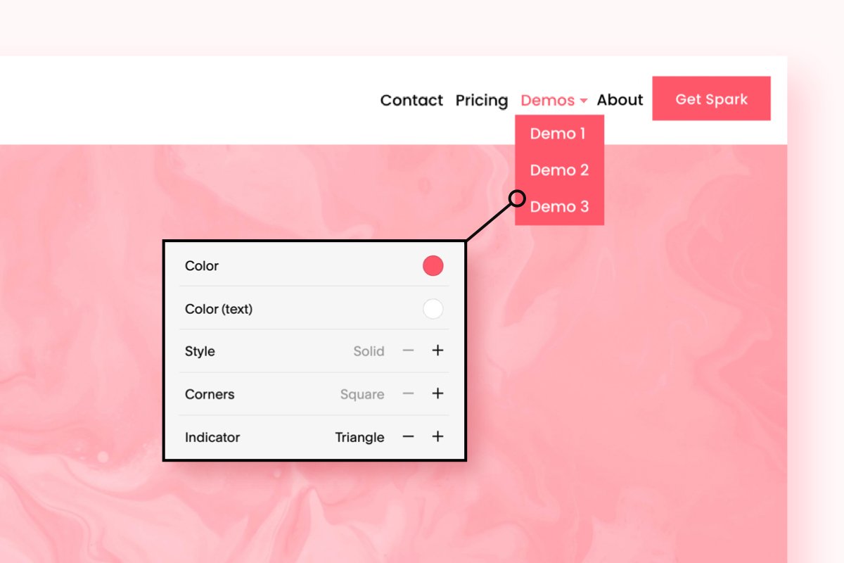
Want to take your Squarespace drop down menu to the next level? With Spark Plugin’s Squarespace Drop Down Menu plugin, you can!
Install it on your website, and you’ll have a new and improved menu that really stands out. The plugin contains loads of different options to customize the drop down menu in Squarespace.
2. Animated line on hover
Bring life to your Squarespace drop down menu style with an animated line that appears when you hover over menu items. This subtle animation can enhance the user experience by clearly indicating which menu item is being selected.
3. Soft rounded corners
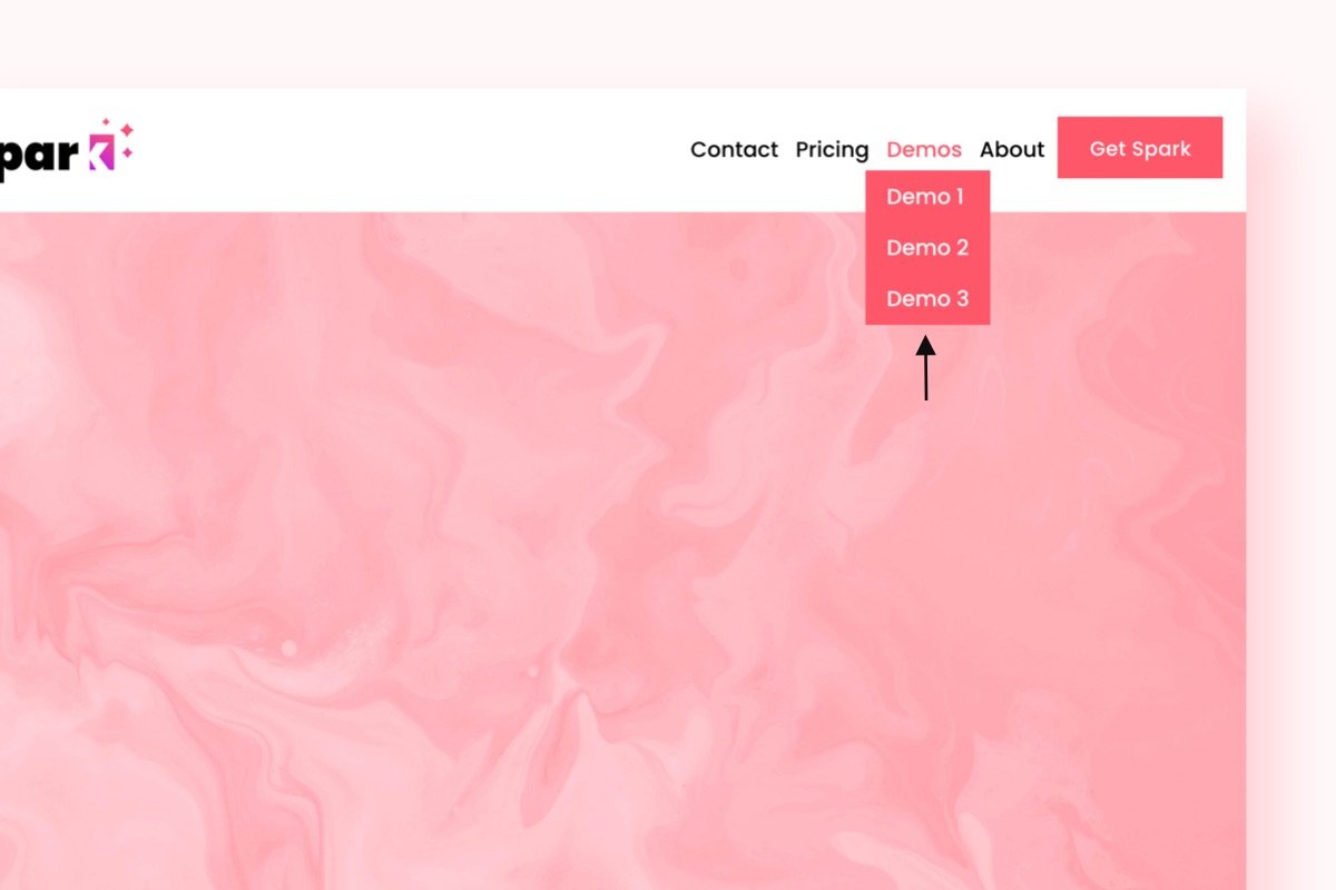
Make your drop down appear softer by using the Squarespace drop down menu CSS below. If you need more options you can use the Squarespace drop down plugin.
Customize: Edit ‘15px’ to change how soft the corners should be.
.header-nav-folder-content {
   border-radius: 15px !important;
}
4. Change the color
Drop down menus can look a little bland, but you can make them stand out with a splash of color!
The Spark Plugin Drop Down Menu Color customization lets you transform your drop down menu to the shade or tone of your choice.
5. Make the top menu item not clickable
A design issue with drop down menus in Squarespace is that the top-level navigation link (i.e. the Squarespace folder) is clickable, even though it shouldn’t be. This can confuse your website visitors.
The good news is you can remove this using the Squarespace drop down menu CSS snippet below:
.header-nav-folder-title {
  pointer-events: none;
}
6. Add an indicator arrow
Guide your users with a visual cue. Adding an drop down indicator arrow helps show that there are more options available under each category.
This small addition can significantly improve navigation on your website. Select between four different arrow types!
7. Add a square on hover
This style adds a hover square highlight around each menu item as the mouse hovers over it. It’s an excellent way to bring attention to the selected item and gives a modern Squarespace drop down menu style.
8. Add a shadow
Adding a shadow to your dropdown provides depth and gives your website a professional touch.
You can do this by using the Squarespace drop down menu CSS below. If you want to do this without code, you can use the Squarespace drop down plugin.
Customize: Edit ‘rgba’ to change the color, and edit the ‘px’ values to change the appearance of the shadow.
.header-nav-folder-content {
    box-shadow: 0 8px 15px -4px rgba(0,0,0,0.2);
}
9. Colored links
Differentiate each menu item with unique colors to make them more attractive and noticeable. This customization not only adds a pop of color to your website but also helps in organizing or categorizing menu items visually.
10. Add a hamburger menu to desktop
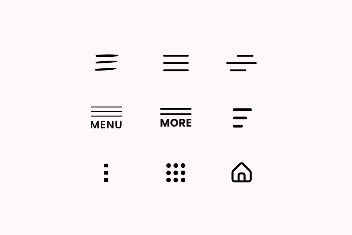
A hamburger menu is typically exclusive to mobile. However if you want to make your dropdown menu sleek and compact, you can use code (as well as Spark Plugin) to display the Squarespace hamburger menu on desktop.
Bonus: Three ways to style more than your Squarespace drop down menu
1. Spark Plugin
Spark Plugin is a design tool with over 100 Squarespace customizations. There’s a good chance that what you’re trying to accomplish is possible with Spark Plugin.
2. Free CSS snippets
If you enjoyed this, then view my longer list of Squarespace CSS code snippets . It contains many free CSS codes that you can use to enhance your website.
3. Customize the navigation bar
Want to take your navigation bar to the next level, not just your drop down menu? Then check out my list of Squarespace navigation bar styles.
How to make a drop down menu in Squarespace
Creating a drop down menu in Squarespace is straightforward and an effective way to organize your site content neatly.
Here’s how to add a drop down menu in Squarespace in 6 simple steps:
1. Click Pages
2. Click the + icon
3. Select Folder
4. An empty folder will appear in the pages panel. Give this folder a name – remember this will be visible on your website.
5. You can then start adding existing pages into this folder to build your drop down menu. The pages you can choose from will be visible in the page menu – just drag and drop them into the folder.
6. You can create new pages by clicking + Add Page, and rearranging the pages so they appear in the order you’d like
That is how you make a Squarespace drop down menu.
Now you can see how your drop down menu is looking by clicking the Hide button and entering full preview:
Did you find any good Squarespace drop down menu style?
In summary, customizing your Squarespace drop down menu style isn't just about aesthetics; it's about enhancing user experience.
By exploring different styles, incorporating CSS and Spark Plugin, and playing with colors and fonts, you can transform your site's navigation into an engaging and stylish feature.
Elevate your website with these tips and make your Squarespace drop down menu a standout element!


