20+ Quick Tweaks for Your Navigation Bar in Squarespace
If you’re bored with how your navigation bar looks, there are plenty of ways you can make it awesome.
You can make the changes through the Squarespace settings, by using Spark Plugin or alternatively, through the CSS editor.
Following are 22 hand-picked ways to edit your Squarespace navigation bar and header that will make your design process faster and easier.
My favorite Squarespace navigation bar CSS and plugins:
1. Incorporate some Glassmorphism
Apple is the leader of the pack when it comes to design, and the unique frosted ‘Glassmorphism’ effect is one of its specialities.
If you want to bring a little Apple style to your Squarespace website, our Glassmorphism header will elevate your site to the next level.
2. Adaptive logo color
Forget the times when your black logo disappeared on a dark background in Squarespace. Now your logo automatically converts to white on dark backgrounds.
3. Change mobile menu icon
Get a header menu icon that matches the rest of your mobile Squarespace website design. Select between a range of different icons.
4. Introduce a mega menu
If you sell many products on your website, a mega menu will let you showcase all your categories and subcategories.
A mega menu isn’t a standard option in Squarespace, but you can create one in CSS with this tutorial. There are a lot of steps, but it’s worth the effort!
5. Hide your navigation bar
A navigation bar is great for guiding your customers around your website. However, there may be some pages where you don’t want a Squarespace navigation bar and want to use CSS to remove it.
For example, a lead magnet page where you don’t want to distract visitors from clicking on your call-to-action.
If you want to hide the navigation bar on only one page, then replace PAGE-ID with that page id, or if you want to hide it on all pages, just remove the PAGE-ID. There is also a guide to hide the header from one page in Squarespace, without the need of a PAGE-ID.
PAGE-ID header {
  display: none !important;
}
6. Make your header float
Enable the header to float over the content on your Squarespace site for an eye-catching effect. Works like magic!
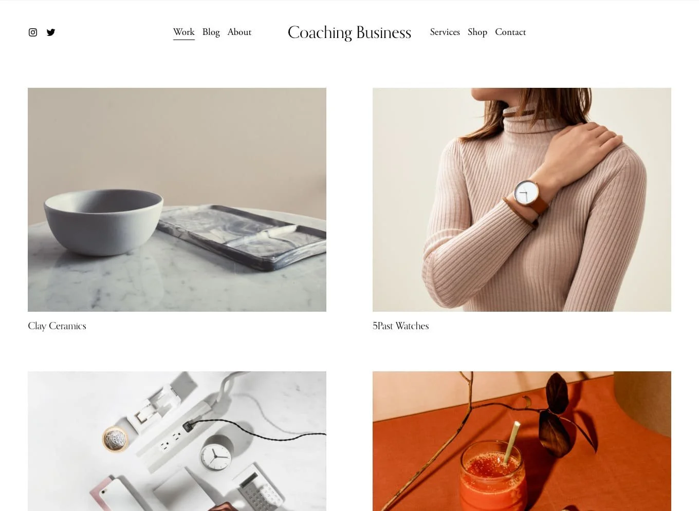
7. Split your navigation bar in two
One of the complaints about the Squarespace 7.1 upgrade was that it removed split navigation, where you could have some elements of your header on either side of your logo.
With this Squarespace navigation bar CSS, you can reintroduce the split navigation that will give your navigation bar a distinct and innovative look.
8. Put in a hamburger
Yum – did someone say hamburger? If you’re a fan of a clean minimal style, this customization will collapse your navigation menu in desktop mode, making everything clean and neat.
9. Make your header transparent
The upgrade to Squarespace 7.1 gave users more functionality when it came to changing the look of their navigation bar.
One of the available options is to make the header transparent, giving your website a more contemporary feel.
Click on EDIT SITE HEADER, go to STYLE, and select DYNAMIC from the drop down menu.
10. Add animated links to your header
Adding some movement to your header can make your Squarespace site less boring. Here’s one of the ways to do that.
There isn’t much you can do to spice up the links in the navigation bar, but with this customisation you can animate them.
11. Animated announcement bar
Draw more attention to your announcement bar with this custom style. It will give your announcement bar a cool animated gradient.
Find out more about the Spark Plugin animated announcement bar
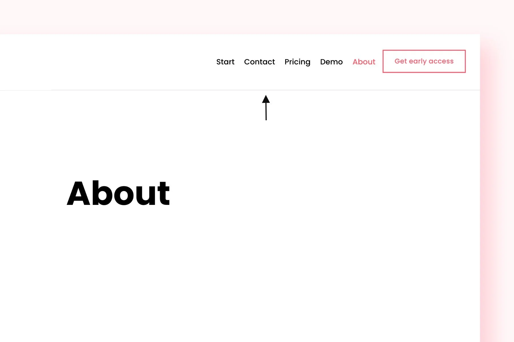
12. Add a separation line
This Squarespace navigation bar CSS snippet adds a simple straight line to your header, so the header is separated from the content. Check out this navigation bar plugin if you want more options.
#header {
  box-shadow: 0px 0px 1px 0px rgba(170,170,170,1) !important;
}
13. Improved drop down menu
Let's face it; the standard Squarespace drop down menu is ugly.
If you aim to enhance the appearance of your drop down menu, this simple drop down customization will render it not only more practical but also more visually appealing.
Find out more about the improved drop down menu
Want more ways to make your drop down menu stand out for all the right reasons? Check out our guide to enhancing your Squarespace drop down menu style.
14. Add a fixed navigation bar
As visitors scroll down your website, the navigation bar falls out of sight, which can be frustrating when your pages are long.
With a fixed navigation bar, your header is always visible, no matter where people are on your page. You can change this in Squarespace – just click on EDIT SITE HEADER, go to STYLE, and make sure FIXED POSITION is turned on.
15. Put in a vertical header
A vertical navigation bar appears on the side of your website rather than on the top. If you’re looking for a unique way for people to access your website, this is the option for you.
It’s easy to add a vertical header with Spark Plugin. Just install, and you can add a vertical navigation bar without having to mess around with complicated code.
16. Mega announcement bar
This announcement bar takes your navigation bar to the next level. It comes with full customizability so you can display whatever you like in the announcement bar.
17. Make a link stand out
Although you can change the colour of your links in Squarespace, they all have to be the same colour. The good news is you can use CSS to change the colour of individual links to get your visitor’s attention.
Paste this code in Website > Website Tools > Custom CSS, and change the color and “2” depending on which link you want to highlight.
.header-nav .header-nav-item:nth-child(2) a {
  color: #ff576a !important;
}
18. Change the colour of your drop down menu
Drop down menus are a must if you have subpages that you want to guide people towards. The problem is, these typically look pretty bland in Squarespace.
Adding colour to your drop down menus gets your web users’ attention and can be handy for categorising your content.
If you need more drop down options, be sure to check out this drop down plugin.
.header-nav-folder-content {
  background-color: rgb(255, 87, 106) !important;
}
.header-nav-folder-item a {
  color: rgb(255, 255, 255) !important;
}
19. Add a secondary navigation bar
When you have a lot of pages on your website, it’s only right that you want to make sure they’re easy to find.
In this scenario, a secondary navigation bar can be a great way to improve the user experience on your Squarespace site and ensure everyone can access all your pages.
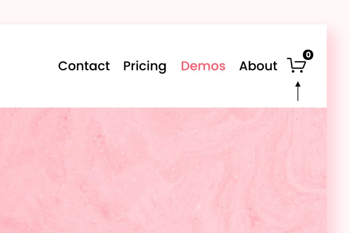
20. Improved shopping cart button
This shopping cart makes it easier to see how many items that’s in the cart, while shopping on your ecommerce site.
21. Search icon
Do you have lots of content on your Squarespace site?
Then it might be time to add a search icon to your site header so that visitors easier can find what they are looking for.
Simply add the Squarespace navigation bar CSS and javascript code from this guide and you’ll have a search icon in your header.
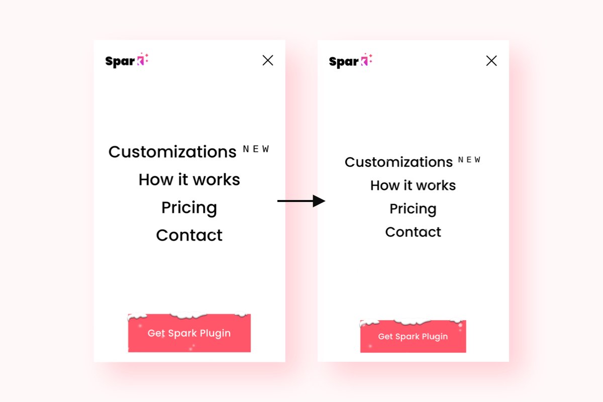
22. Improved mobile navigation
This enhanced mobile menu improves the look and feel of your mobile website, improving the customer experience and making it easier for visitors to find what they are looking for.
Bonus: 3 more ways to edit your Squarespace navigation bar
1. Spark Plugin
Spark Plugin is the perfect choice if you want to change how your Squarespace site looks but don’t want to use CSS.
With Spark Plugin, you get over 100 customisations to make your website stand out. Whether you want to edit your navigation bar, images or text, this tool has everything you need.
Check out the customisations available today and see how Spark Plugin can help you create the Squarespace site you’ve been dreaming of.
2. Squarespace settings
A navigation bar (sometimes called the header) is the space at the top of your Squarespace website. It is available on all pages of your site.
If you want to edit the navigation bar in Squarespace, all you need to do is open your website and click EDIT in the top right-hand corner of your page. Once you’ve done this, highlight your navigation bar and select EDIT SITE HEADER.
Some of the options available to you include:
Adding a site title and logo
Adding call-to-action buttons, social media icons and customer login links
Changing the layout of your navigation bar
Find out more about building and editing your Squarespace navigation bar.
3. Code your own Squarespace navigation bar CSS
You can also use CSS code to add additional functionality to your navigation bar using Squarespace’s CSS editor. Just visit the Home Menu, click Website, then scroll down to click on Website Tools, and lastly Custom CSS.
A quick word of warning about the Squarespace navigation bar and CSS. While CSS is extremely powerful and can enhance your Squarespace navigation bar, it’s important to make sure any code you use is correct. Invalid CSS code can potentially break your website.
I hope this short guide has inspired you to edit your Squarespace navigation bar. What will you do to make it stand out?


