Squarespace for Restaurants: 12 Stunning Website Examples
If you run a restaurant, takeaway service, or café, Squarespace is a fantastic choice for your website.
You get a massive selection of templates, making it easy to create a site that reflects your own unique style.
Not only this, but there are plenty of gallery options for showcasing your mouth-watering dishes, and a scheduling feature so customers can effortlessly book tables online!
Considering a Squarespace site for your restaurant? Here are 12 gorgeous Squarespace restaurant examples to spark your creativity!
p.s. Want more ideas? Here are over 60 Squarespace websites to inspire you!
1. Elma
The color scheme on this website is beautiful. The fresh greens indicate healthy food and locally sourced products, all without saying a word.
I love the stunning imagery and how the website designers have made the most of Squarespace's functionality – hover over the different categories to bring up beautiful photos.
2. Freemans Restaurant
If you have a small and intimate restaurant, you want your website to give off the same warm and cozy vibe. Freemans Restaurant's site accomplishes this!
I like how the majority of the website sits on one page, including the menu. It makes it easier to view on a mobile device when you're out and about looking for a nice place to eat.
3. The Imperial
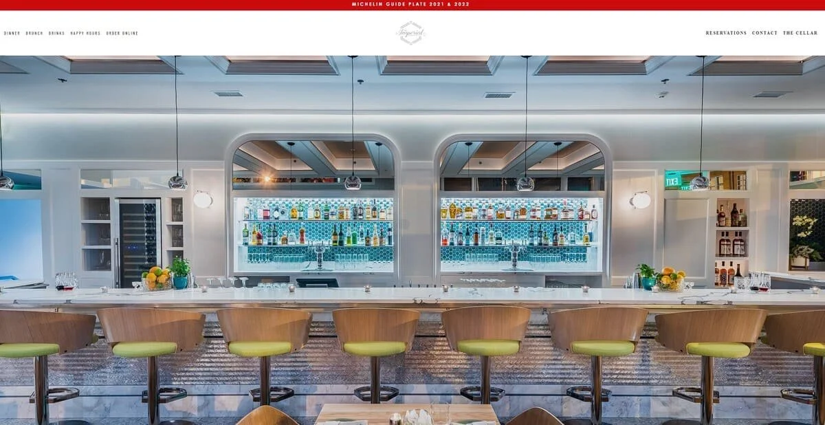
As well as the gorgeous photo of the Imperial's bar, one of the first things you notice on this homepage is the banner advising that the bar has been in the Michelin Guide – that's definitely something you want to shout about.
Like quite a few of the Squarespace restaurant websites in this article, The Imperial has an email signup form. Perfect for keeping both prospective and existing customers in the loop!
4. Blue Dog NYC
I love the esthetic Blue Dog has gone with here – it's modern, but the muted colors and font add a touch of traditionalism.
Plus, the website uses Squarespace's image capabilities to full advantage to show off all the delicious food!
5. King Restaurant
When you have a restaurant website, it's important to show off not just your restaurant's interior and exterior but also the food you create.
King Restaurant uses three carousels on its homepage to show off its simple yet extremely high-quality food.
6. Egg Shop
Clean, simple, and just a little bit quirky, this Squarespace website stands out from the crowd!
I also like how Egg Shop uses Squarespace's best-in-class eCommerce functionality to sell additional products, from cookbooks to hot sauce!
7. Bandits Diner
This restaurant shows that it knows its target audience with a funny tagline, 'Cold beers. Real good eats. Okay people too.' A website is a great way to show off your restaurant's personality, and Bandits Diner definitely achieves this.
A small critique - this website is quite heavy-handed on the pop-ups. You get two of them as soon as you visit the homepage!
8. Com Vietnamese
This website is very minimalist and simple – preferring to prioritize the gorgeous photos of the Vietnamese food on offer.
I also love that there's a map that doesn't just show where the restaurant is but also the best place to park.
9. Nice Day
There's something about this website that really makes me smile – I love the photography and how the food is presented!
It's great that the website has testimonials from happy customers and food reviewers too. This provides lots of fantastic social proof and is great for encouraging customers to make a booking!
10. LaLou
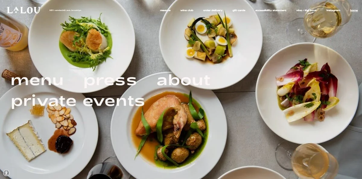
As the old saying goes, 'you eat with your eyes' – and this is certainly the case with LaLou. The photos of the food are beautiful!
The website uses muted grays and whites, which look highly professional, but can be hard on the eyes. However, the website does have extensive accessibility options you can use to make the text more readable.
11. The Meatball and Wine Bar
Meatballs and wine together? I'm sold!
I really like the retro vibe of this website; the rounded text makes me think of fast-food restaurants from the 1980s. Plus, the photography is first-class, the hero image summarizes precisely what this restaurant is all about.
12. Poco NYC
Poco NYC isn't as stately as some of the Squarespace restaurant websites on this list, but it's still endearing in its own way!
The colour scheme works well; the combination of the hero image and the neon logo shows that this is a venue that is fun in the daytime and even more fun at night! The website also proudly displays the awards and accolades it has won, giving people another incentive to visit.
Bonus: 3 beautiful ways to style your Squarespace restaurant website
If you're looking for a code-free way to make your restaurant website stand out from the crowd, Spark Plugin has over 100 fantastic customizations! Here are three of my favorites.
1.Build a striking carousel
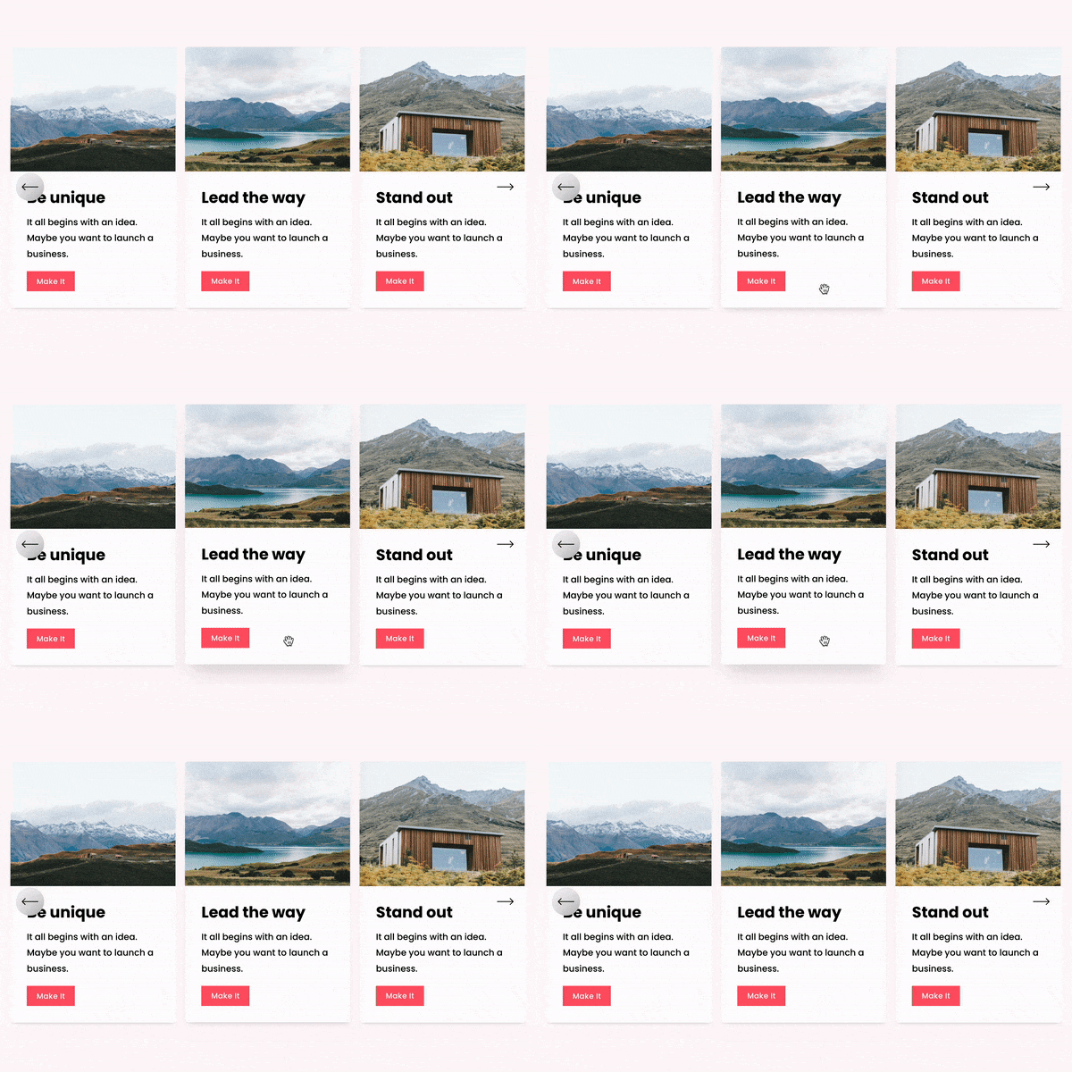
These inset lists and carousels combine text and images to create stunning page elements visitors can't help but click on! Use them to display your menus, show off your latest events, or introduce customers to your restaurant staff.
Want something animated? Spark Plugin has you covered there too. Our scrolling logo carousel is fantastic for showcasing photos of your delicious food!
2. Create show-stopping text
Want something more than the default fonts that come with Squarespace? These bright and vivid custom text styles will draw the eye and make prospective customers remember your business!
3. Add a button to make you stand out
If you want people to download your menu or sign up for your mailing list, an animated button will encourage page visitors to convert! Choose from eleven fantastic styles, including the drop shadow above.
If you enjoyed this list of Squarespace restaurant examples, you’ll find our favorite Squarespace restaurant templates useful. Use them to inspire you when you build your brand-new site!


