10+ Super Useful Squarespace Summary Block Customizations
Want to encourage people to stick around your website?
Adding links and signposts to content they might like is a great way to increase the amount of time they spend on your website, as well as boost your conversion rate.
You can do this on Squarespace with a summary block. In this article I’ll explain what summary blocks in Squarespace are, as well as show you some cool customizations to make your blocks stand out!
Squarespace summary block customizations you’ll love
Squarespace offers some ways to style your summary blocks — keep reading to find out how to add a block and how to style it. However, there’s a lot more you can do with them if you want them to pop off your page.
You can style your Squarespace summary block with CSS, but this is a fiddly process if you’re not sure what you’re doing.
The best way to make your summary blocks stand out? Through a customization.
Customizations are code-free, provide lots of flexibility, and you can apply the same settings to all the summary blocks on your site for consistency.
Here are some of my favorite customizations to get you started.
1. Add a clickable call-to-action to your images
The standard Squarespace summary block has your image, text, and call-to-action separate from one another. But what if you could merge them together?
This simple customization adds a clickable call-to-action inside your image, providing a fresh and contemporary look.
p.s. Want to do even more with your carousels? Check out this guide to creating an amazing Squarespace image carousel!
Inset lists and carousels by Spark Plugin
2. Add an image card to your summary images
Want your image and text to remain separate, but still want them to stand out a little more than the default offering? This customization is the perfect choice.
Add this customization to your site, and you can add a clear, defined card to your summary images, making your page look slick, streamlined, and professional.
Card lists and carousels by Spark Plugin
3. Add a modern hover reveal effect
There will be times that you want your images to stand out by themselves, for example, if you operate an eCommerce site or want to show off your portfolio of work.
This customization adds a hover reveal to your summary block, so the text and call-to-action only show when someone moves their mouse over the image.
Hover reveal effects by Spark Plugin
4. Change up the font style
You can change the font size of the text on your summary block, but you can’t change the font itself. This customization lets you choose from a range of engaging and bold font styles to make your summary block stand out.
Choose from a different color text, highlighted text, or even a quirky animated striped style!
Seven vivid text styles by Spark Plugin
5. Add a custom call-to-action button
Want to encourage your customers to click or to buy? A call-to-action button is essential for drawing the eye and getting those all-important engagements.
With this customization, you can choose from a wide range of different button styles. Pick an animated gradient, a modern frosted effect, or even a fun and festive flurry of snow!
Custom button styles from Spark Plugin
6. Add a cool frosted style
If you’re a fan of the frosted, minimalist Apple style, you’ll love this Glassmorphism customization.
This adds an opaque overlay to your summary block, enhancing your images and making your website look fresh and modern.
Glassmorphism lists and carousels from Spark Plugin
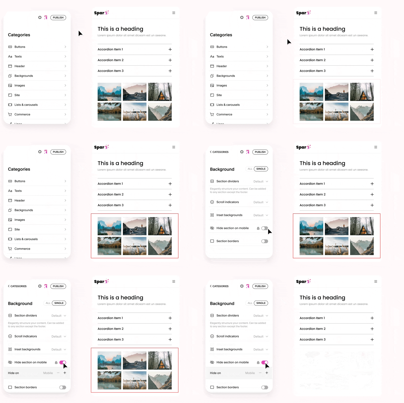
7. Hide your summary blocks on mobile
Clear and simple navigation on mobile devices is essential for a good user experience and enhanced search engine rankings.
If you love your summary blocks on desktop but don’t want to show them on mobile, this customization is a lifesaver. You can use it to hide not just summary blocks but any type of block you want.
Block visibility from Spark Plugin
8. Change your link style
If the click-through rate on your summary blocks is low, changing how your links look can give you a welcome boost.
This customization offers four modern and innovative link styles. Choose from two different animated underlines and two different rollover links. Plus, you can change the color to suit your unique branding and style.
9. Add even more items
The maximum number of items you can add to a Squarespace summary block is 30, but this nifty customization raises it to an incredible 250!
It uses lazy loading to do this, meaning adding this many items to your block won’t affect your site speed.
Lazy load summaries from Squarewebsites Plugin
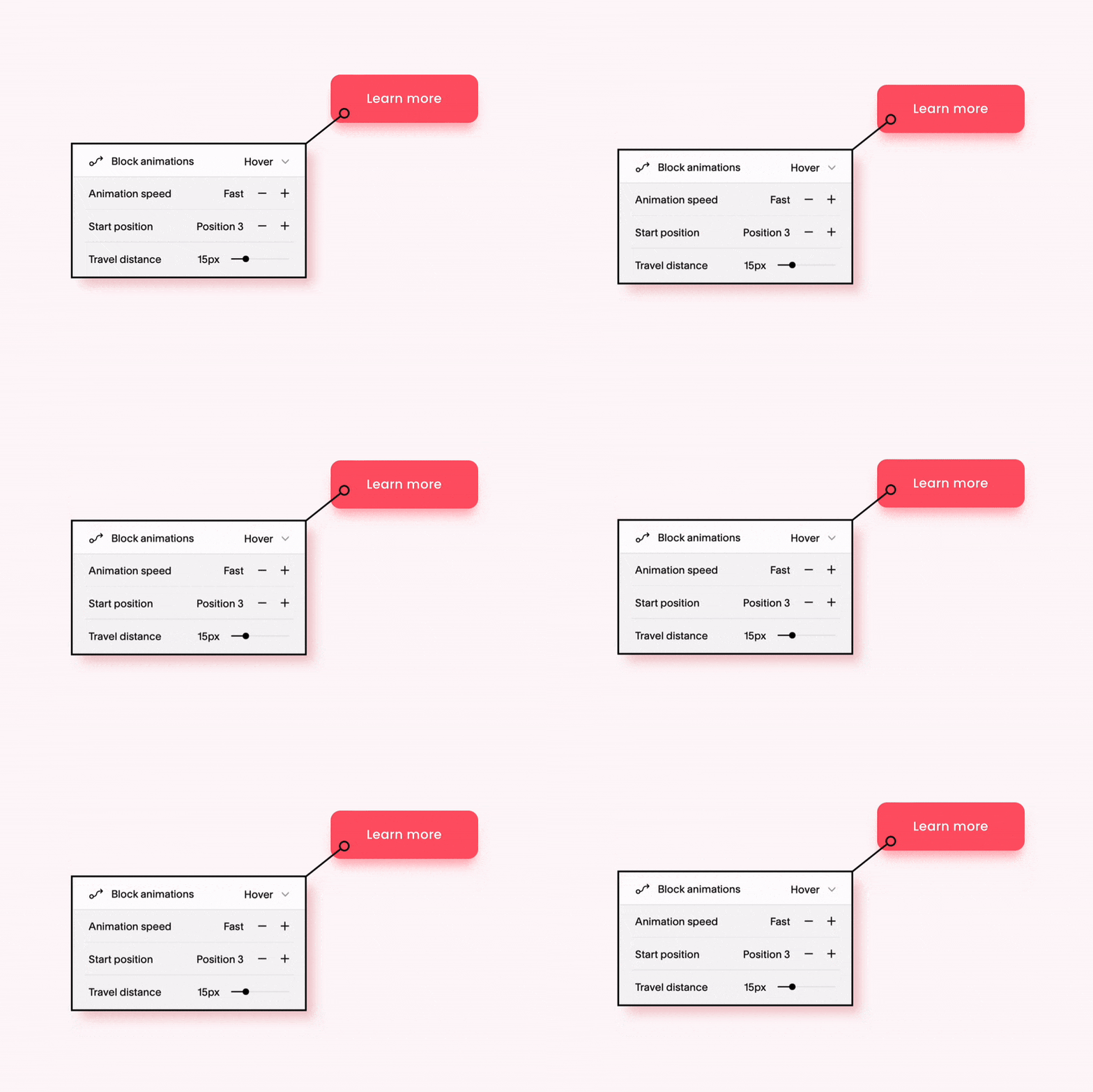
10. Add a fun animation
This handy customization adds an exciting and dynamic animation effect to any block on your website – not just your summary blocks!
Choose from a subtle fade or pulse, or an eye-catching spin or shake!
Animate blocks from Spark Plugin
11. Easily manage dates of Squarespace summary blocks
Streamline the date management in summary blocks by unifying date formats and enhancing the datepicker with month and year views for faster updates. Perfect for reorganizing or migrating content more quickly.
Change Squarespace date format universally
Datepicker for publication status
What’s a Squarespace Summary Block?
A Squarespace summary block is a special type of content block you can use to present a summary of your collection pages.
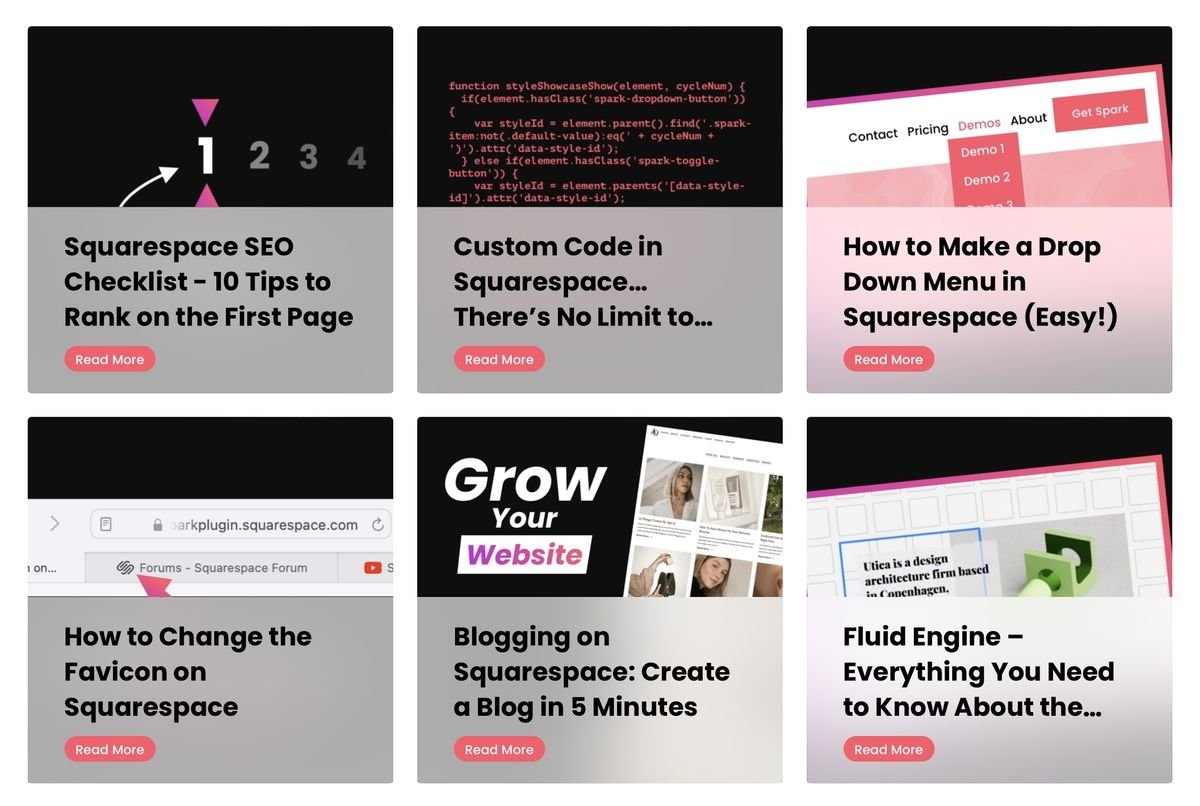
So for example, let’s say you’re writing a blog post on your website, and you want to highlight some related articles that the reader might be interested in. You can use a summary block to do this, like so:
You can also use Squarespace summary blocks to highlight a list of upcoming events, cross-sell products on an eCommerce page, and show web visitors a collection of curated videos.
The possibilities are endless!
How to add a summary block in Squarespace
You can add and customize a summary block on your page in just three minutes! Here’s how to do it.
First, go to the page you want to add a summary block to. Click the blue plus (+) button to add a block and choose Summary.
Then, choose the Content you want to pull into your summary block. Bear in mind that you can only showcase information from your collection pages.
You can filter by elements like date posted, category, tag, or author. Squarespace will automatically show the changes you make, so you don’t need to preview the page to see how your summary block looks.
Then, click Design to style your Squarespace summary block and choose the number of items you want to feature.
Now you know more about summary blocks in Squarespace and how to style them. Which customizations on this list will you use?

